Cloudflare
Building Cloudflare's First Data Visualization Design System
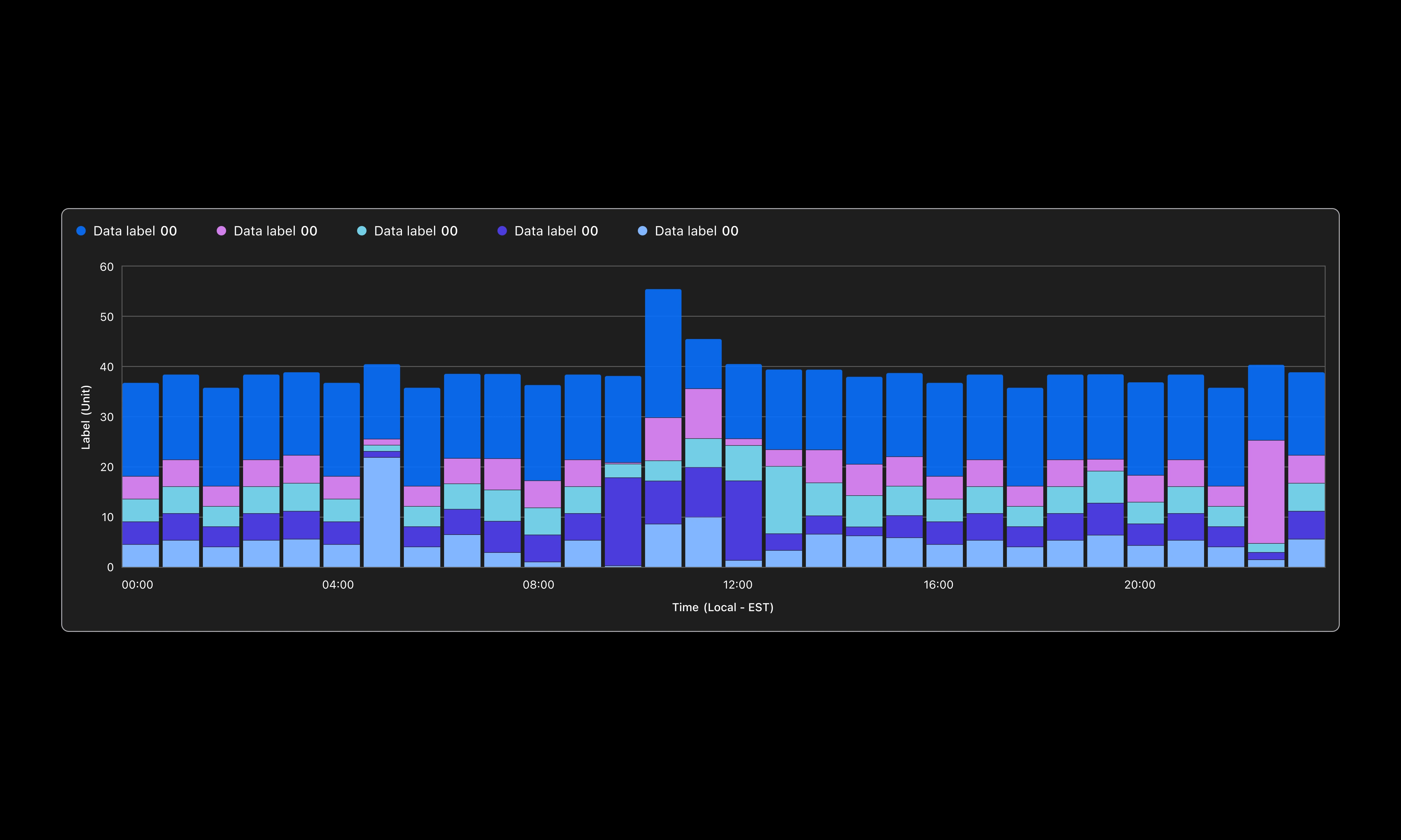
Overview
Cloudflare Analytics had five separate design systems running in parallel, with no shared foundation for how charts filtered, interacted, or behaved. I led the effort to consolidate them into one, starting with a single high-leverage component and using that early momentum to build a full system and drive adoption across 50+ engineering teams.
A Fragmented Visualization Ecosystem
Cloudflare's analytics ecosystem had evolved organically across multiple teams. By the time I joined Cloudflare, there were five separate design systems in use across analytics experiences. Each was built independently, with no shared foundation, no consistent interaction patterns, and no unified approach to data visualization.
Without shared standards, each dashboard introduced its own filtering behaviors, visualization decisions, and interaction patterns. Designers repeatedly solved the same UX problems independently, creating inconsistent experiences for users and mounting technical debt for engineers.
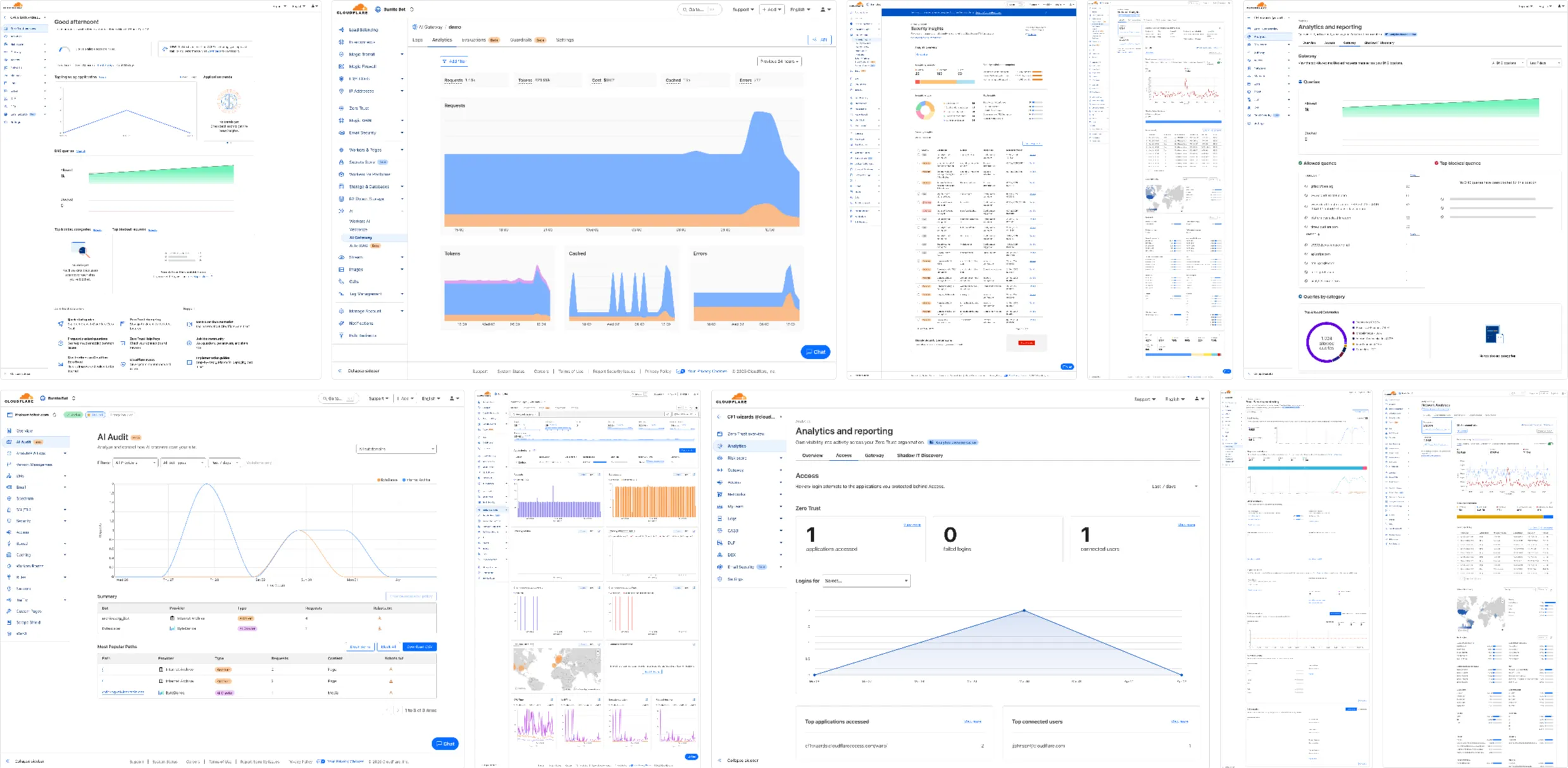
Why it mattered
The bigger problem wasn't the visual divergence, it was the behavioral one. Users couldn't rely on predictable interactions across analytics experiences, and teams lacked a shared foundation for building scalable products. Similar workflows behaved differently between products, forcing users to relearn patterns from dashboard to dashboard and increasing cognitive load at every context switch.
My Role at Cloudflare
I joined the Design Systems team specifically to address the fragmentation across analytics experiences. This was one chapter in a longer journey at Cloudflare, spanning nearly two years and multiple teams, but the design systems work was distinct: it required thinking at the system level, not the product level.
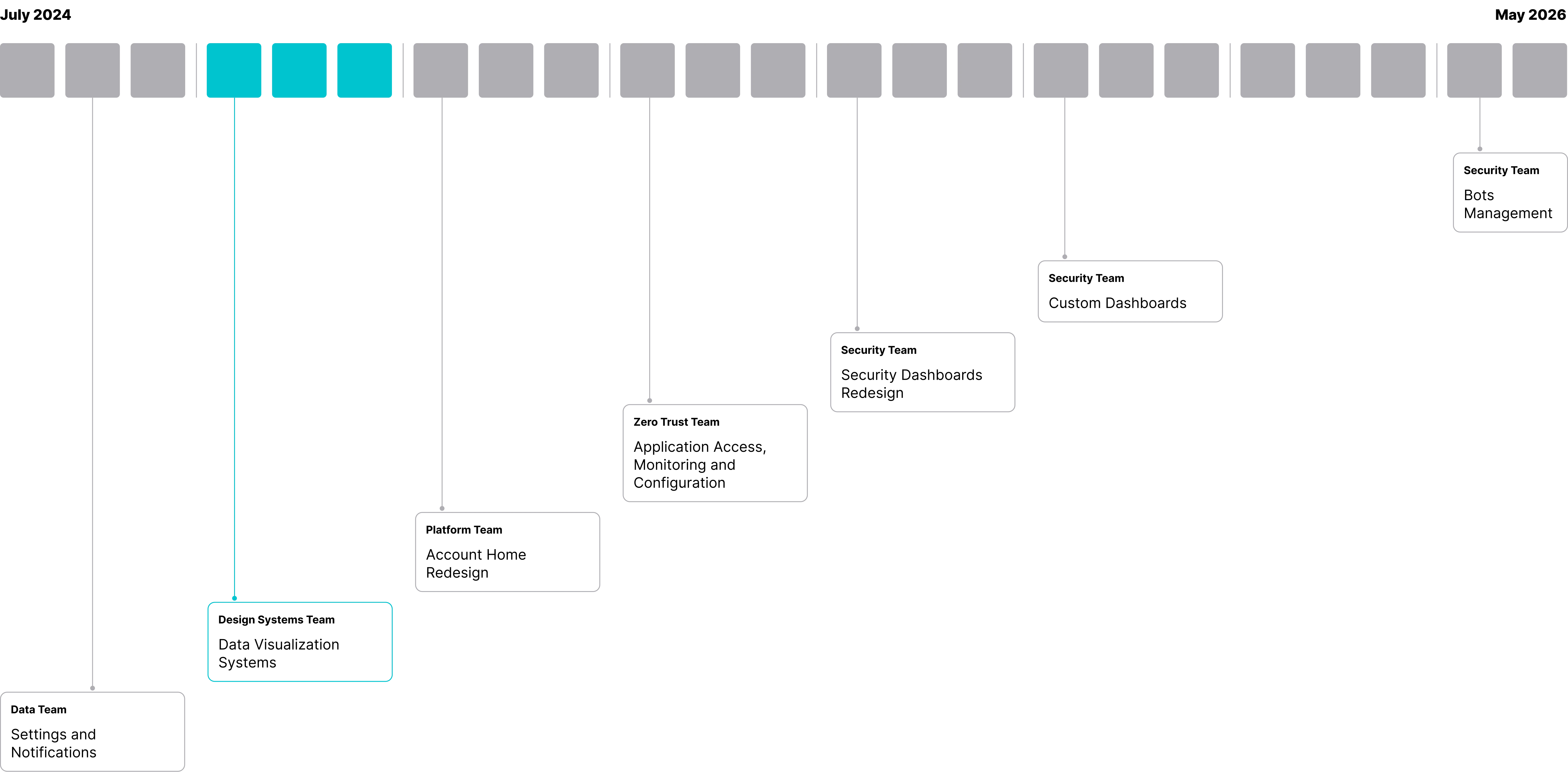
The Design Systems work (highlighted) was the foundation that informed all subsequent work across Platform, Zero Trust, and Security teams.
Discovery & Audit
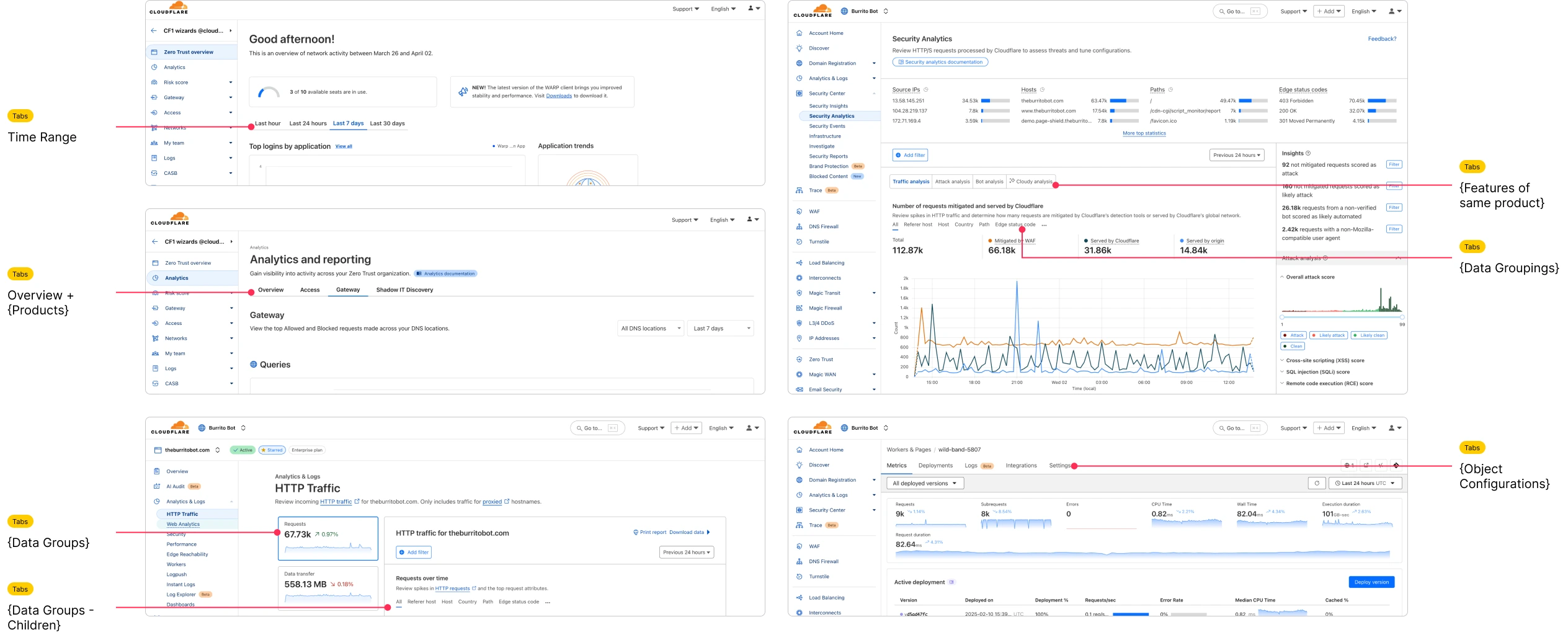
Before designing anything, I needed to understand the full landscape of what existed and what was broken. The audit drew on four distinct sources: customer feedback, support ticket analysis, frontend engineering interviews, and product interviews.
Audit categories
- UI Audit: chart types, color usage, spacing, typography, layout structures
- UX Audit: hover behaviors, drilldowns, filtering, sorting, empty and loading states
- Pattern Audit: legends, tooltips, section headers, date range pickers, filter structures
- Technical Audit: existing libraries, component duplication, variants, responsiveness gaps
Audit framework
| Area | What I evaluated |
|---|---|
| Consistency | Did similar charts behave the same way across products? |
| Scalability | Could teams reuse patterns without reinventing them? |
| Accessibility | Keyboard navigation, color contrast, screen reader labeling |
| Localization | Date and time formatting, label truncation, RTL considerations |
| Responsiveness | Dense dashboards across mobile, tablet, and large display breakpoints |
| Learnability | Could users predict interactions based on prior experience in other products? |
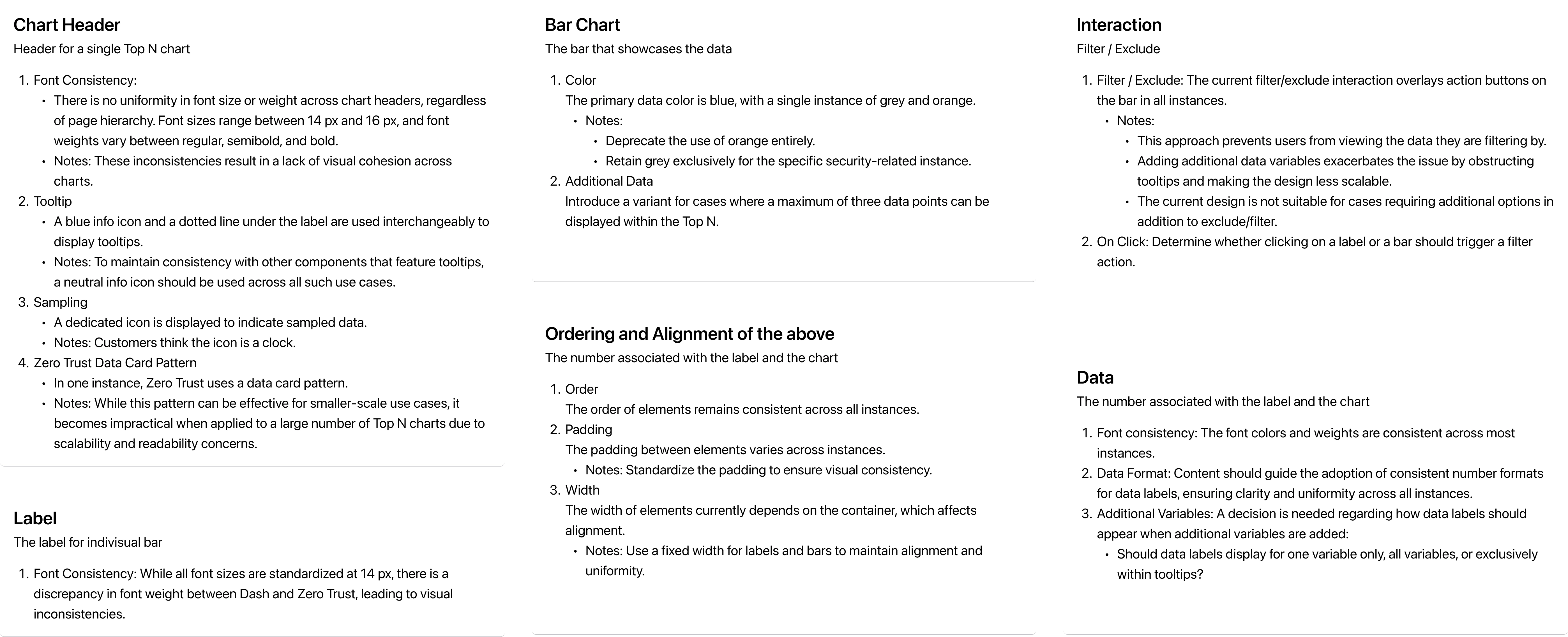
The audit artifact covering use cases, section header patterns, interaction states, and component behaviors cross-referenced with customer feedback and internal team interviews.
Product discovery
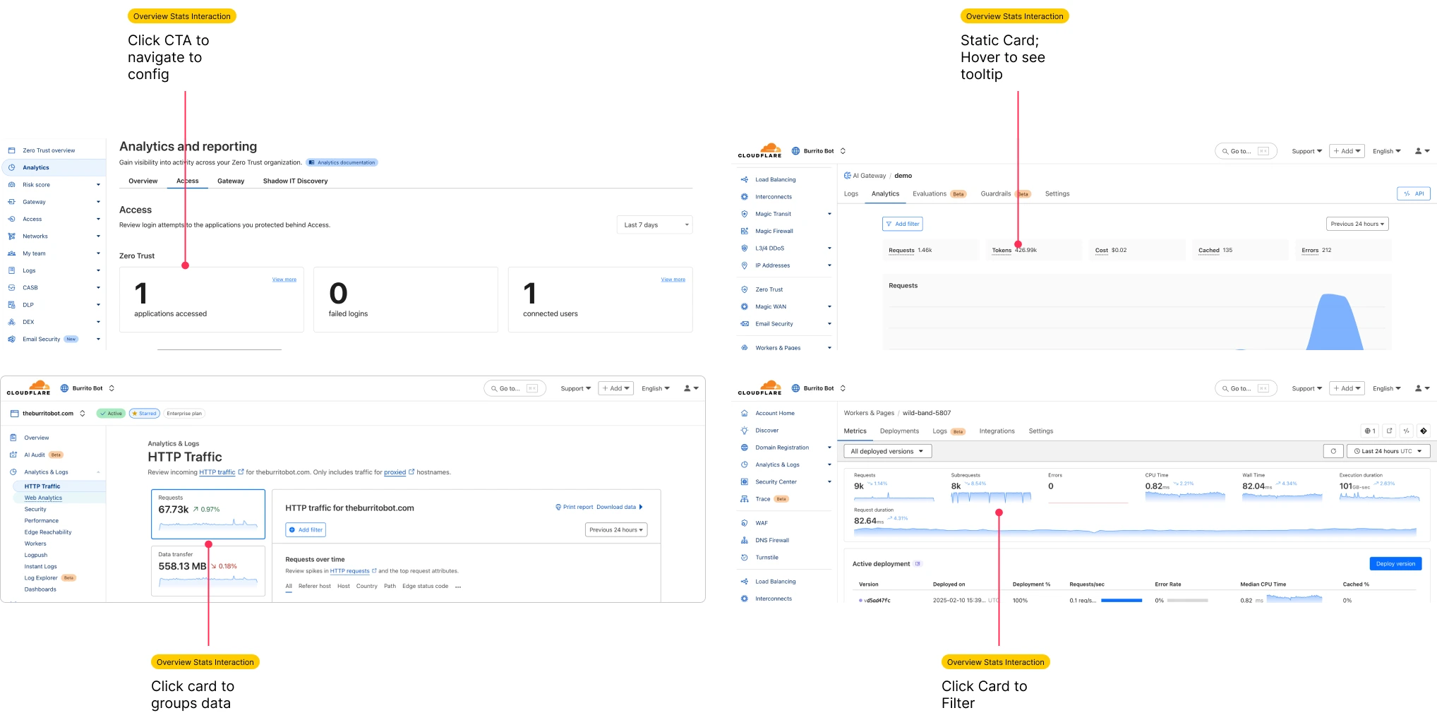
Alongside the documentation audit, I reviewed existing analytics pages in-product to understand real-world usage, edge cases, and the gap between intended and actual behavior.
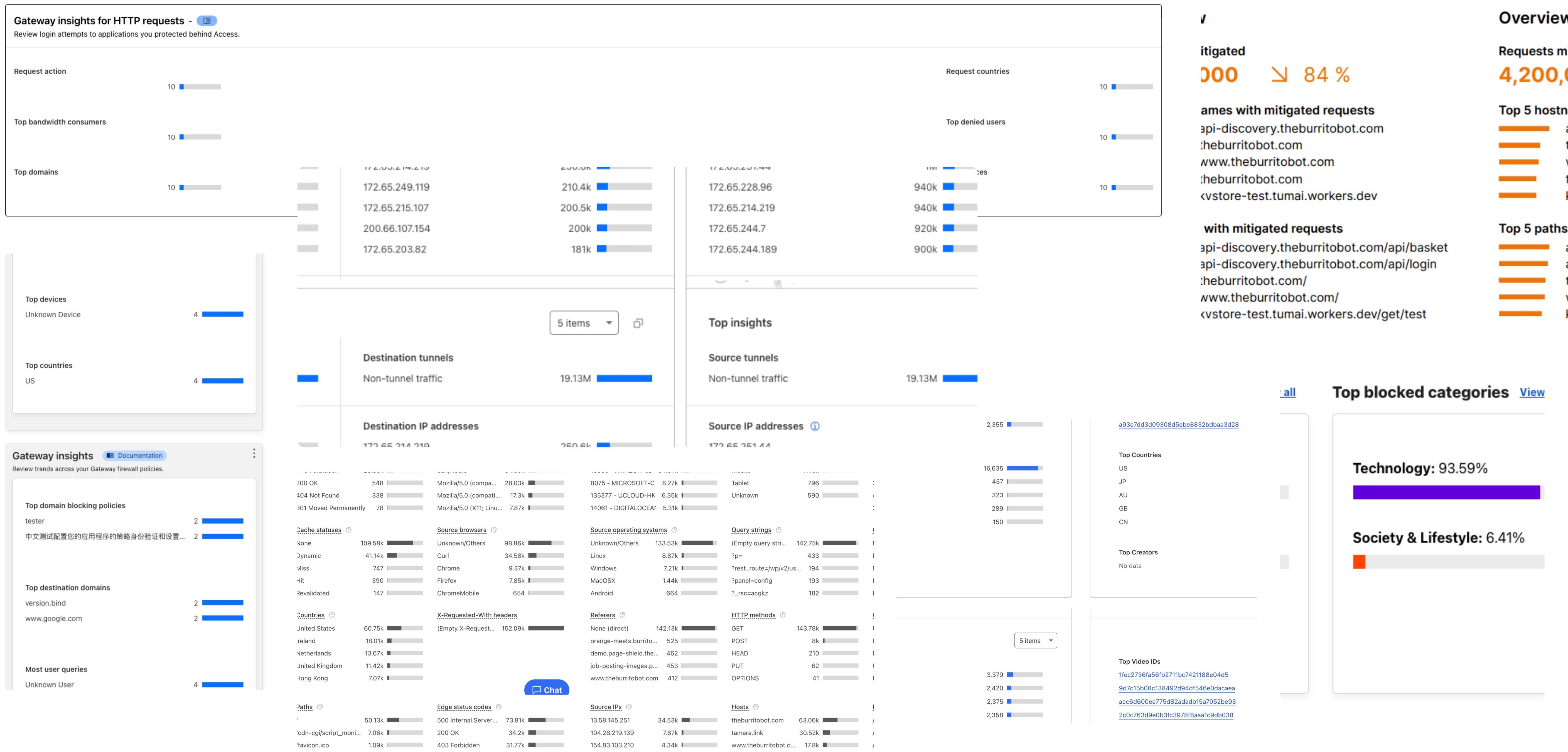
Key insights
- Users struggled most when charts of the same type behaved differently across products
- Filtering patterns were inconsistent between products, creating friction in investigative workflows
- Dense data visualizations lacked visual hierarchy, making it hard to identify what mattered
- Hover and tooltip interactions became unreliable at smaller screen sizes
- Teams were reinventing chart behavior independently, slowing delivery and compounding inconsistency
The biggest issue wasn't visual inconsistency. It was interaction inconsistency. That reframing shaped every subsequent design decision. The goal wasn't to clean up the UI, it was to establish a shared behavioral foundation.
Prioritizing for Adoption
With five design systems and dozens of divergent components to address, a full system rewrite wasn't realistic. The strategy was to start with the component that would deliver the greatest visible impact fastest, and use that early win to build organizational buy-in for broader adoption.
Why Top N?
Rather than redesigning the entire ecosystem at once, I focused on the most widely used visualization pattern: the Top N chart. It appeared across nearly every analytics surface at Cloudflare, making it the fastest opportunity to create visible impact, validate the system approach, and drive cross-team adoption.
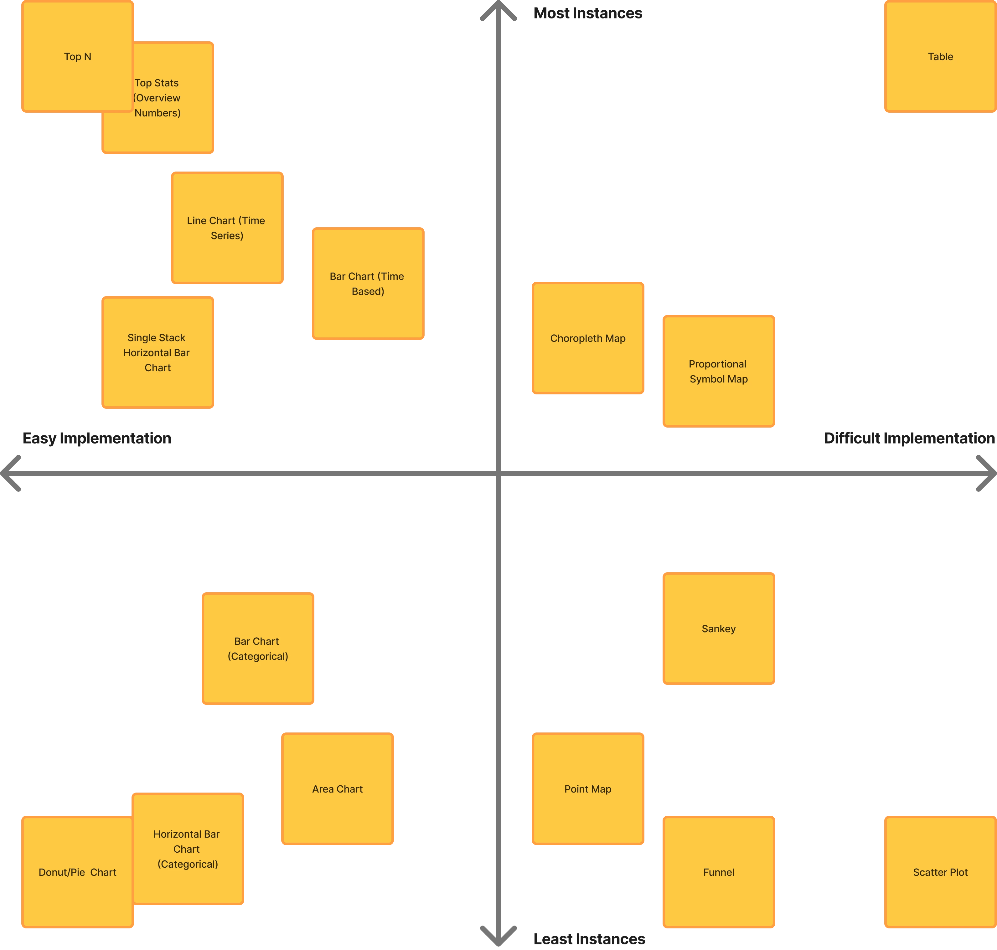
Targeting a high-visibility component used across products allowed me to quickly standardize interactions, demonstrate the value of a shared system, and build organizational buy-in for broader adoption.
Designing the Top N Component
The Top N component design followed a structured methodology that became the template for every component in the system, from requirements and interaction states through anatomy, properties, dark mode, responsiveness, accessibility, and usage guidelines.
Defining requirements
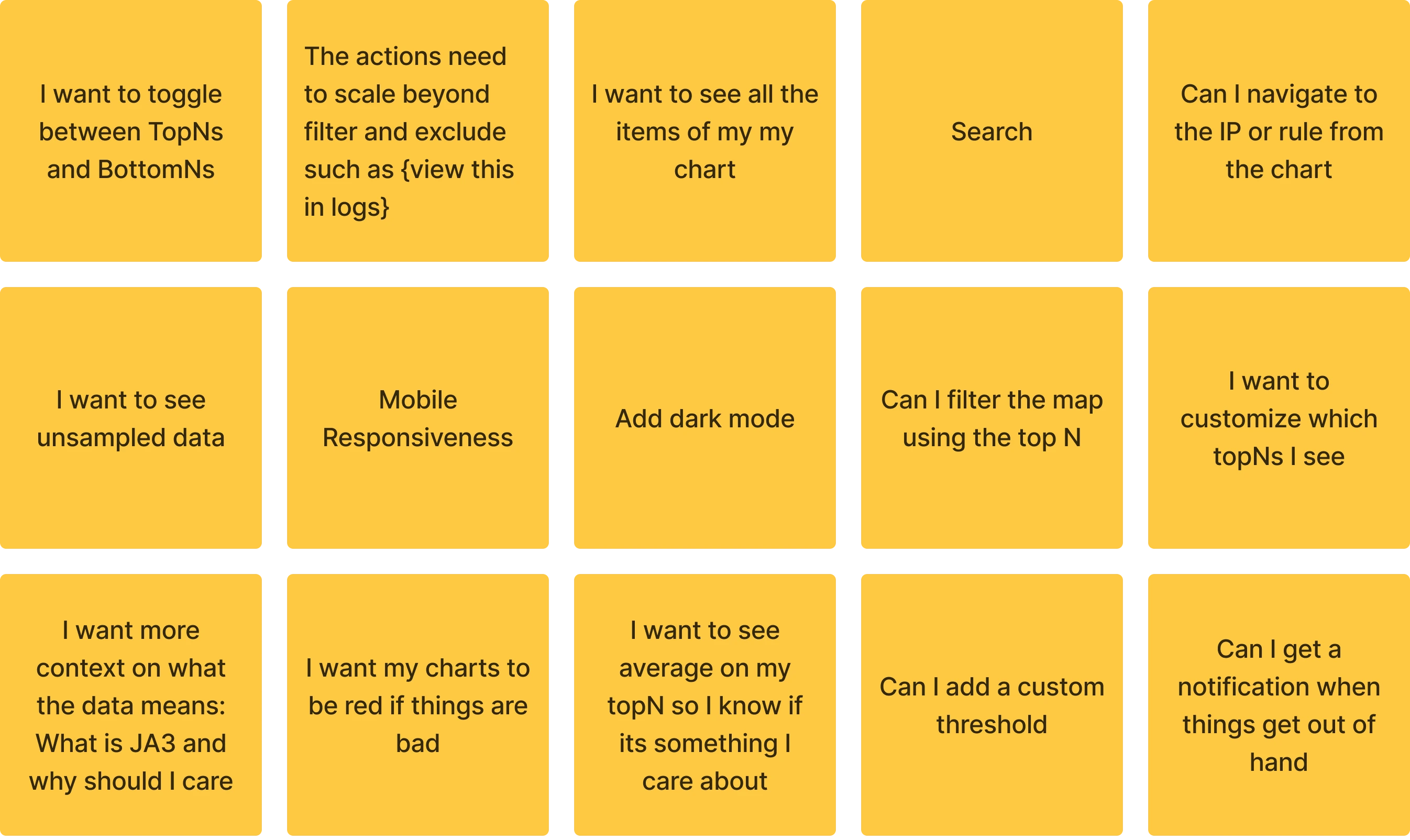
Each requirement represents a distinct user need or open design question that needed resolution before component design began.
Anatomy
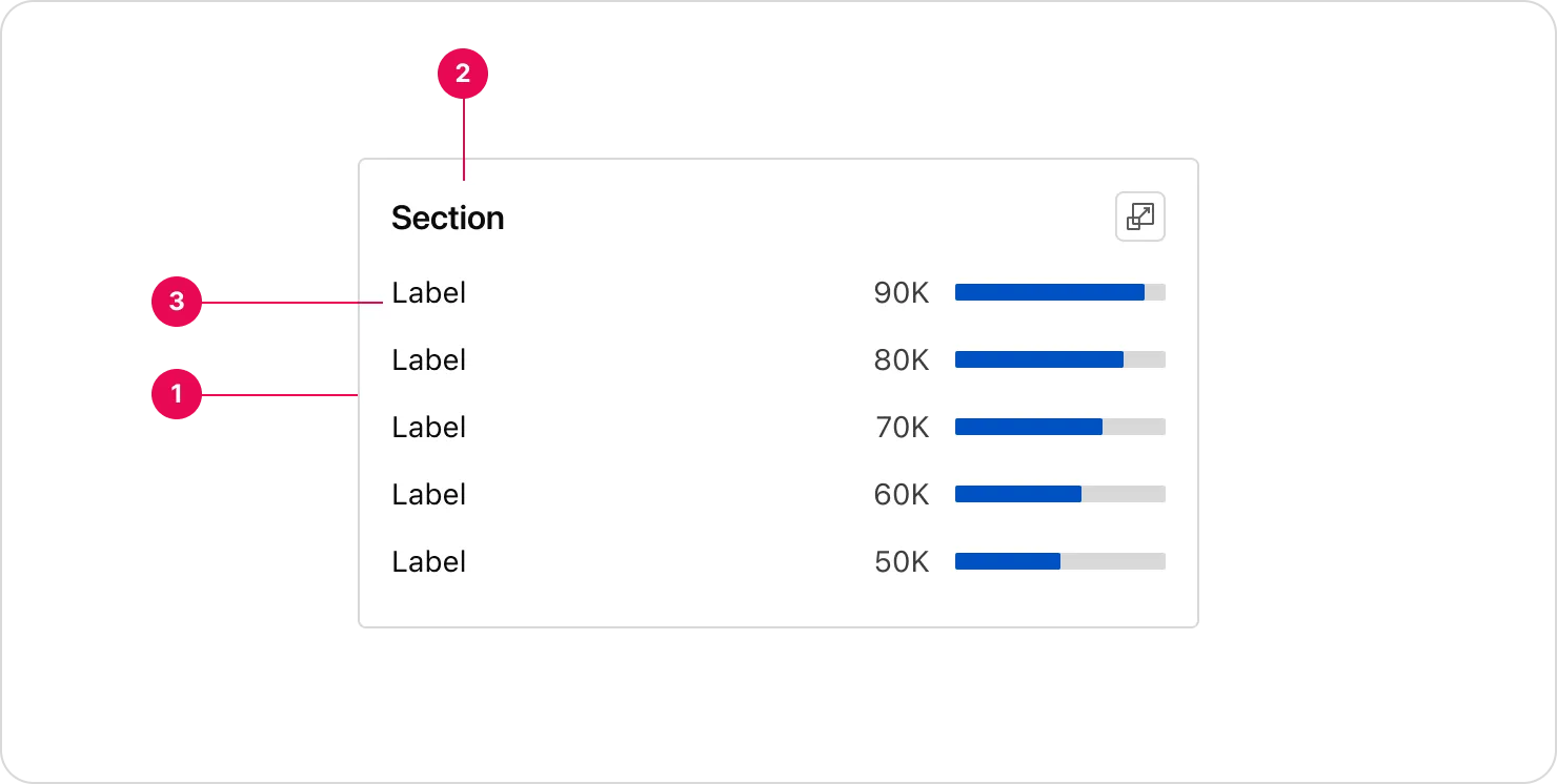
The anatomy documentation broke down every sub-component, the Data Visualization Header, the individual Top N rows, and the parent container, with explicit spacing, sizing rules, and Figma auto-layout settings to remove ambiguity at handoff.
Layout & spacing
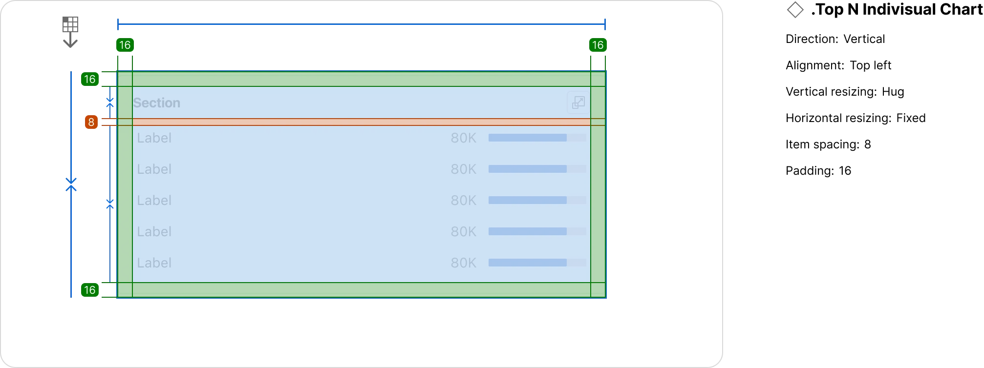
Alongside anatomy, explicit layout specifications covered padding, item spacing, minimum and maximum widths, and how the component behaved when expanding from compact to full-width views.
Interaction states
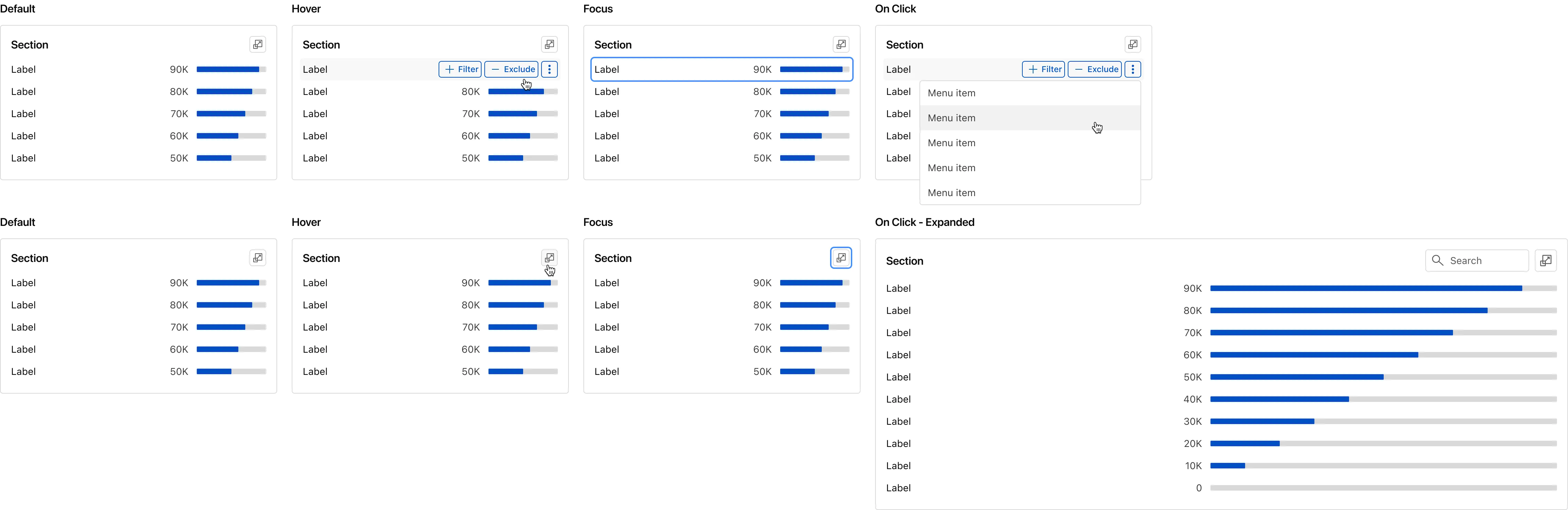
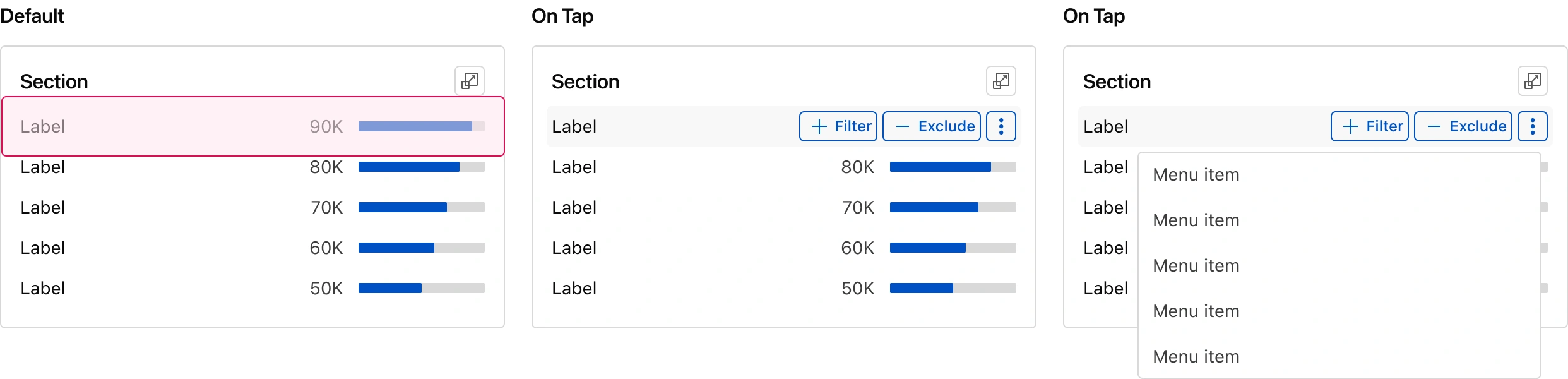
All four interaction states, plus the expanded on-click view that reveals all data points rather than the default Top 5.
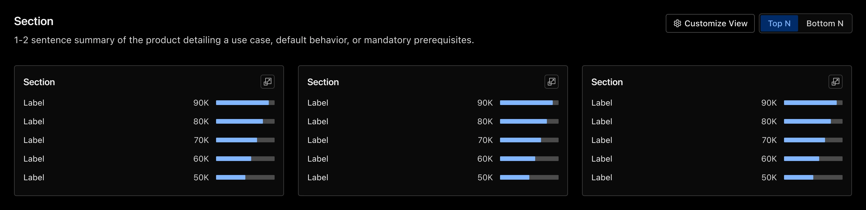
Dark mode
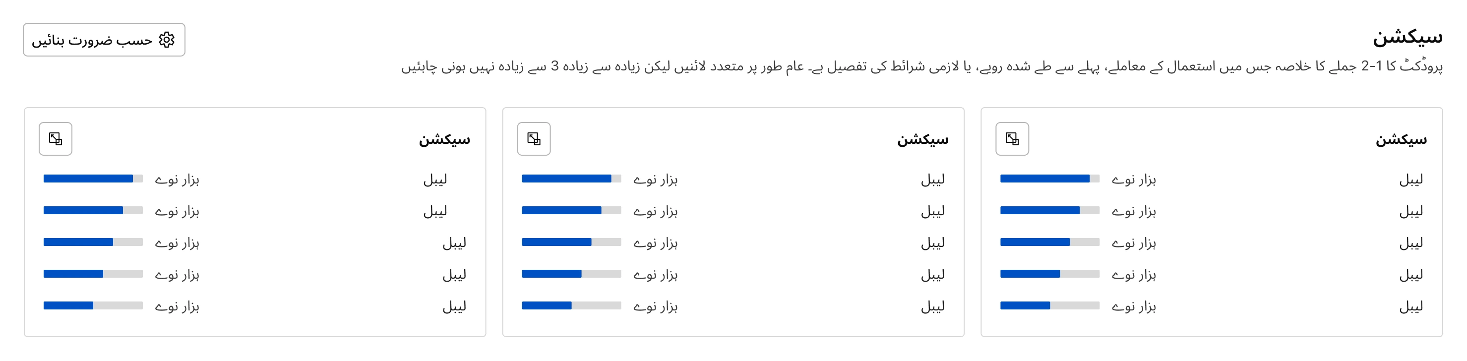
Localization
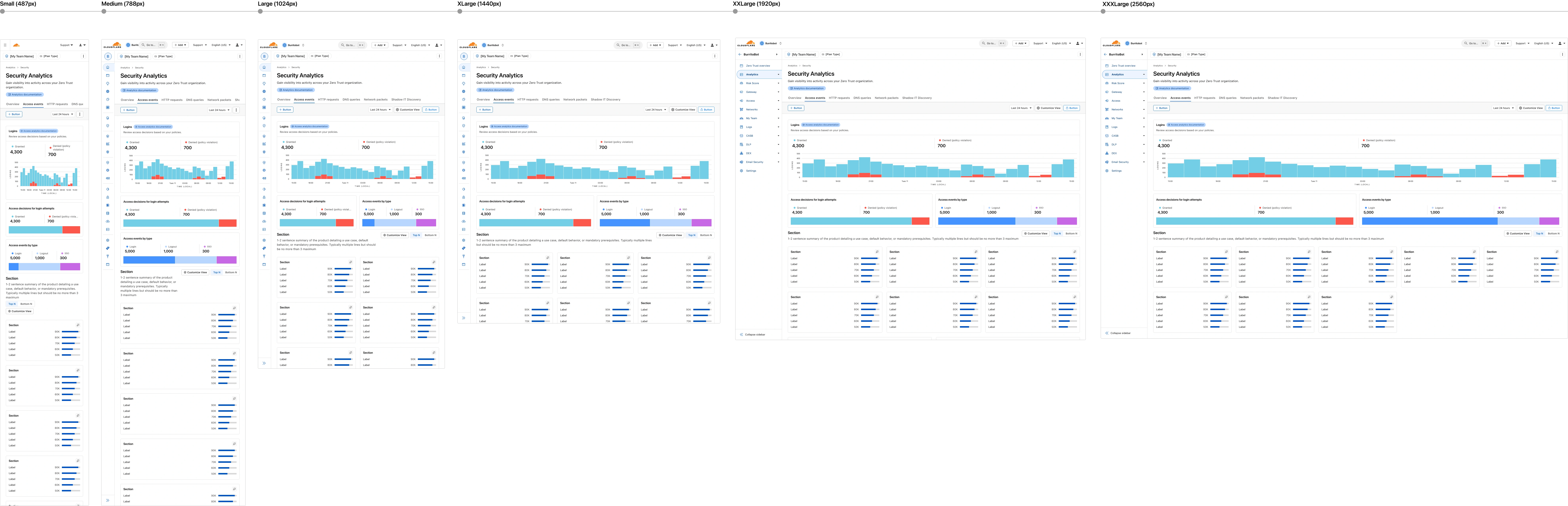
Responsiveness
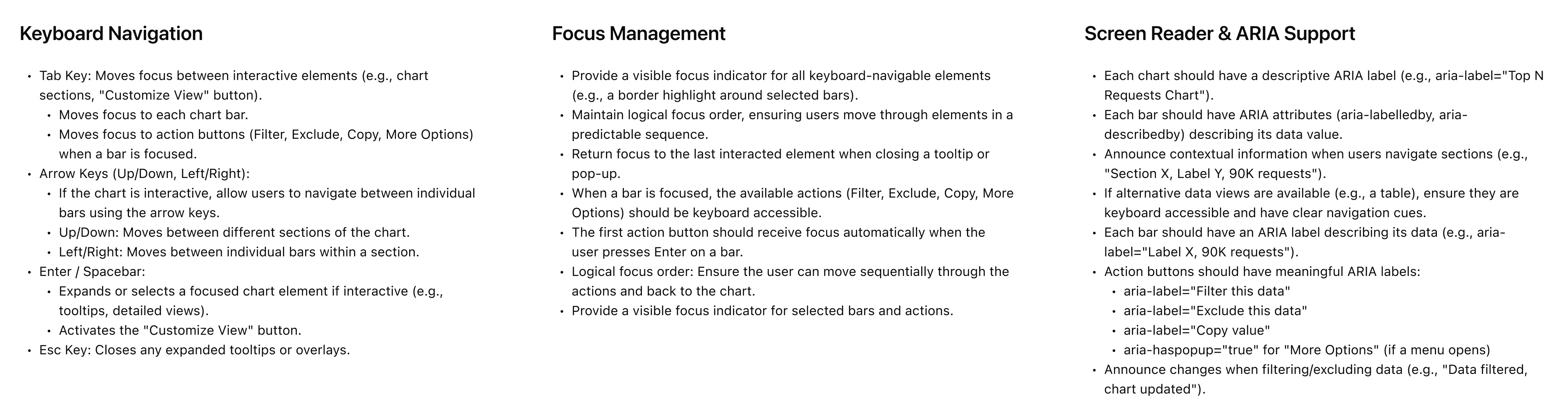
Accessibility
Accessibility was specified alongside the component design, not retroactively applied. Keyboard navigation patterns, focus management rules, ARIA roles, and screen reader support were all documented as part of the component spec.
Mobile interactions
Mobile-specific touch targets, tap behaviors, and interaction patterns were specified separately from desktop to ensure the component worked correctly across all device contexts, not just scaled down.
Usage guidelines & edge cases
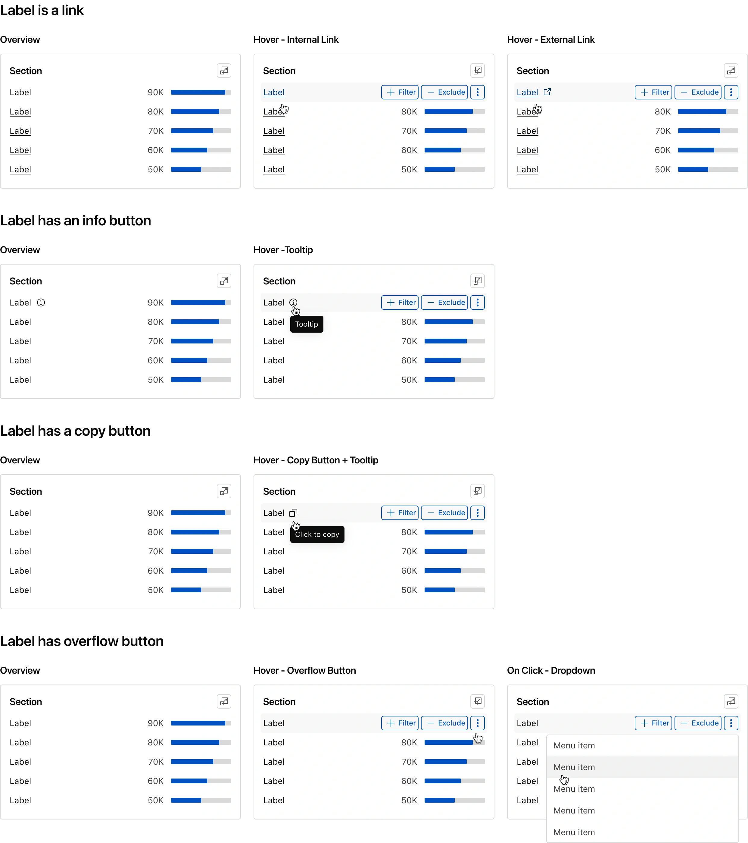
A system only works if teams know how to use it correctly. Usage guidelines covered nuanced edge cases: labels as internal or external links, info tooltip rendering on hover, behavior when data is unavailable, and how the component handles truncated or overflowing content.
One of the more subtle edge cases came from the data itself. Some datasets returned every record in a single response, so users could expand the component and search across the full dataset in-place. Others were paginated, which meant the component had to communicate that constraint clearly while still feeling like the same component. The usage guidelines documented both patterns and defined a single expansion and search behavior that worked in either mode, so the component wouldn't fork into two.
Before & after
Before, the same Top N view rendered 12 different ways across products, with different tooltip anatomies, empty states, sorting behaviors, and keyboard interactions in each. A user who learned one had to relearn the pattern in the next. After, every instance shared the same behavioral contract: one tooltip pattern, one set of hover, focus, and keyboard interactions, one way to sort and drill down, and one empty and loading state, regardless of which product it appeared in.
Before

After

Scaling Beyond the First Component
Top N was the wedge, but consolidating five design systems required building a foundation every team could build on. This meant establishing shared color tokens, typography scales, spacing systems, and a comprehensive library of chart and supporting components covering the full range of visualization needs across Cloudflare's analytics surfaces.
Chart component library
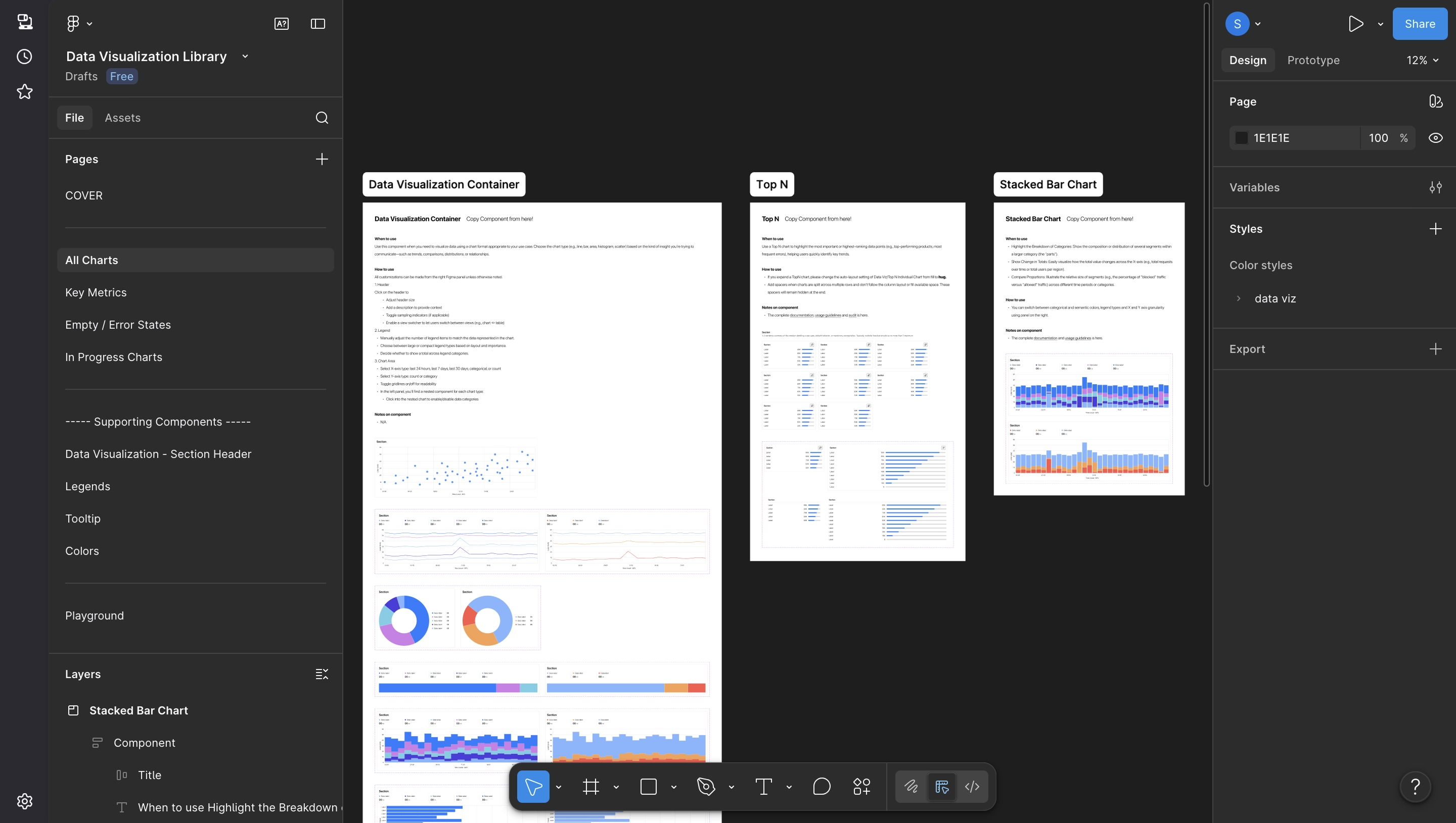
The system grew to 30+ reusable components, organized into four categories based on the type of analytical question they help users answer.
Foundational
Top Metrics, Tables, Line, Bar, Stacked Bar, Horizontal Bar. The everyday building blocks used in nearly every dashboard for tracking counts, trends, and rankings.
Comparative
Distribution, Histogram, Scatter plot. For questions about how values are spread or how two variables relate, common in security investigations and performance analysis.
Flow & Relationship
Sankey, Funnel. For traffic and conversion workflows where users need to see how volume moves between stages or sources.
Geographic
Choropleth map, Point map, Proportional symbol map. Cloudflare's data is inherently geographic: attacks, requests, and performance vary sharply by region.
Supporting components
Charts were only part of the picture. Standardizing the surrounding analytical experience, the containers, controls, and contextual elements that frame every visualization, was equally critical.
- Chart containers and section headers
- Legends and tooltip patterns
- Filter structures and date range pickers
- Loading, empty, and error states
- Data export controls
The distinction matters: the system didn't just standardize charts. It standardized the entire analytical experience.
Driving Adoption Across Teams
A design system that teams don't adopt is just documentation. Getting 50+ engineering teams onto a shared system required more than good components. It required finding the right moments to get in front of teams, making it easy to say yes, and building enough visible momentum that skeptics became advocates.
Finding the right moment
One of the biggest adoption challenges with any design system is timing: reaching teams when they're already motivated to change, not when they're heads-down shipping something else. We solved this by building a custom automation, an OpenCode skill that monitored project activity and sent the PM, EM, and me a notification whenever a PM was spinning up a new dashboard project or an engineering team was beginning a cleanup cycle.
Those two signals were the highest-leverage adoption moments: a PM starting fresh had no legacy debt to untangle, and an eng team in cleanup mode was already primed to reduce inconsistency. Rather than making teams come to us, we showed up at exactly the right point in their workflow, reaching out, walking through the value, and offering hands-on onboarding help. Teams started with the system instead of discovering it mid-project.
Onboarding and visibility
- Presented the system at all-hands meetings to establish broad visibility across design and engineering
- Gave monthly updates to keep momentum visible and communicate what was new or improved
- Hosted company-wide data visualization office hours where teams could give feedback, ask questions, connect with others using the system, and collaborate directly with engineering
- Worked with multiple PMs to scope cleanup epics into upcoming quarters, making adoption a planned workstream rather than an interruption
The cleanup epics became the tipping point. What started as a bottom-up effort to demonstrate value had earned enough momentum to become a company-wide standard.
Outcomes and Impact
- 5 independent design systems consolidated into a single analytics foundation
- 30+ reusable charting and supporting components built and documented
- 50+ engineering teams adopted the shared standards, with a company-wide mandate for full adoption by Q1 2027
Product impact
UI and UX consistency across analytics surfaces gave users predictable interactions regardless of which product they were in, a pattern surfaced repeatedly in follow-up user interviews. Designers reported completing new dashboard designs roughly 50% faster, spending time on the actual design problem rather than re-litigating solved ones.
Team impact
As engineering adopted shared components, QA cycles surfaced fewer small UI detail issues per release. Standardized specs reduced back-and-forth at handoff and eliminated duplicated design and engineering work across teams.
Reflections
The wedge strategy works
Starting with Top N rather than attempting a full system overhaul was the right call. One highly visible, high-quality component built more organizational trust than a roadmap of 30 promised ones. Teams adopted it quickly because it solved a real pain they already felt, and that early momentum made everything that followed easier.
Documentation is the product
The Figma components were only half the work. The usage guidelines, edge case documentation, accessibility specs, and responsive behavior tables were what made the system usable at scale. Investing in that documentation upfront made the difference between a component that gets used and one that gets forked. It also let me hold a firmer line on flexibility: the system standardized the behavioral layer (how charts filter, how states transition, how keyboard navigation works) while giving teams room to configure within those constraints.
Behavioral consistency is harder than visual consistency
Consolidating five design systems revealed that the visual differences were the easy part. The harder problem was the behavioral inconsistencies: divergent interaction models, conflicting filter behaviors, different keyboard navigation patterns, and even how the underlying APIs returned data. Those required cross-team alignment, not just design decisions. That alignment work was as much the job as the design itself.
Adoption is a timing problem, not a marketing one
Waiting for teams to discover the system would have meant catching them mid-project, after patterns were already set. Building an automation to detect the right adoption moments, like a PM starting a new dashboard or an eng team beginning a cleanup, changed the dynamic entirely. The outreach felt helpful rather than disruptive because we showed up when teams already had a reason to change. Proactive timing mattered as much as the quality of the system itself.
Systems work creates compounding returns
Every component added to the system made the next one cheaper to design, implement, and maintain. By the time the system included 30+ components, teams were shipping analytics features faster than before, not despite the shared system but because of it.