Data Visualization
Data Democracy & the Burgeoning of Totalitarianism
About the Project
This static visualization poster was submitted for the World Data Visualization Competition 2023 at the World Government Summit. It delves into past, present, and future progress; assessing the global advancements and improvements in recent years, the current state of affairs, and the methodologies used to gauge progress. Additionally, it scrutinizes the factors and drivers that could influence society, government, and citizens in the future.
The work was longlisted for the World Data Viz Prize 2023 by Information is Beautiful.
Data Exploration
I began by exploring various datasets and examining patterns and relationships, as well as identifying outliers and anomalies.

Data Focus
After conducting preliminary research and exploring various datasets, I decided to narrow my focus on examining the change in internet access; a lens through which broader shifts in freedom, control, and governance become measurable and visible.

Secondary Research
After conducting preliminary research and exploring various datasets, I narrowed my focus to examining the changes in internet access and their relationship to shifting political landscapes and internet freedom globally.

What's in the News
To gain a comprehensive understanding of the frequency of these occurrences, I reviewed news articles reporting from the ground and analyzed posts across various social media platforms.

Analyzing the Data
After reviewing various datasets, I decided to focus the data visualization on showcasing the changes in internet freedom over the past decade and highlighting key internet controls; the mechanisms governments and institutions use to restrict, monitor, and manipulate online access.

Design Iteration
I went through the process of refining and improving the visualization module through repeated cycles of feedback and modification; testing different ways of encoding the data before arriving at a form that felt both clear and compelling.

Design Elements
After exploring various style elements such as colors, fonts, and guidelines, I developed a final design system and module outline that effectively communicates the data without letting aesthetic choices overpower the message.

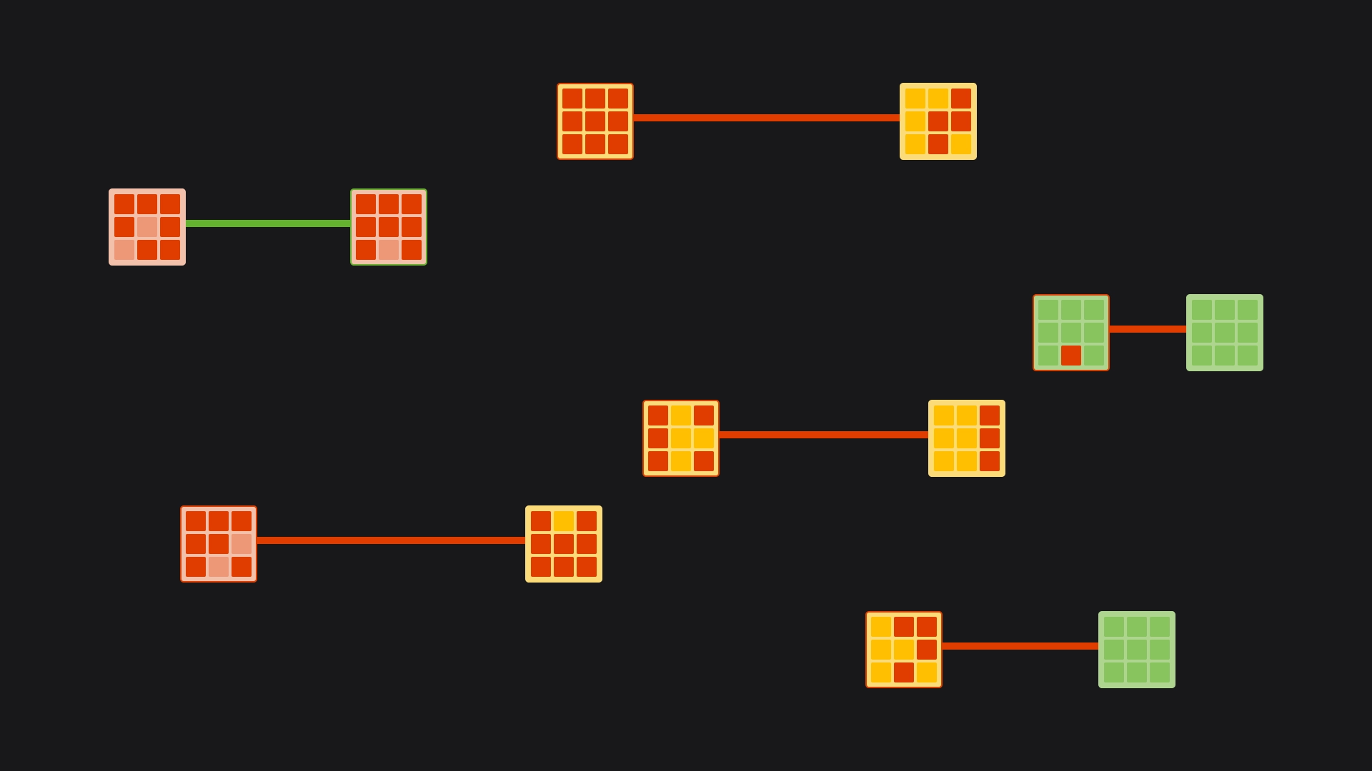
Design Detailing
Incorporating Semiology of Graphics principles, I utilized retinal variables such as shape, orientation, color, and value to add multiple layers of information and detail to the design module; allowing readers to engage with the visualization at different depths.

Design System
A design system was created to ensure consistency and ease in designing and implementing the final visualization. This system included details such as colors, fonts, and different visualization elements; providing a reusable framework for the poster's visual language.

Final Poster
The completed visualization presents a layered narrative; tracing the trajectory of internet freedom globally, surfacing the mechanisms of control, and situating the viewer within a broader story about data, democracy, and power.
