Illustration Design · Data Visualization
Earth in Flux
Visualizing Climate Change Through Data and Illustration

About the Series
Earth in Flux is a series of seven data-driven illustrations, each examining a distinct dimension of the climate crisis; from greenhouse gas escalation and glacier retreat to coral bleaching, deforestation, and the quiet disappearance of urban lakes.
Each piece translates scientific data into visual form, making the scale and stakes of environmental change legible to a broad audience. Together, they build a portrait of a planet under pressure, and the choices, individual and collective, that brought it here.
Greenhouse Gas Escalation
The illustration abstracts the escalating levels of greenhouse gases resulting from human activities between 1990 and 2010. Scientists have projected that this rise could potentially elevate the global average temperature by 0.3 to 4.8°C; generating new patterns and extremes of drought and rainfall, and potentially disrupting food production in specific regions.
The illustration is divided into four distinct sections, each representing an average period of five years. Every color corresponds to a specific greenhouse gas, while the size of the circles symbolizes the volume of the respective gas in the atmosphere. The connecting lines represent the causal factors contributing to the increase in emissions.
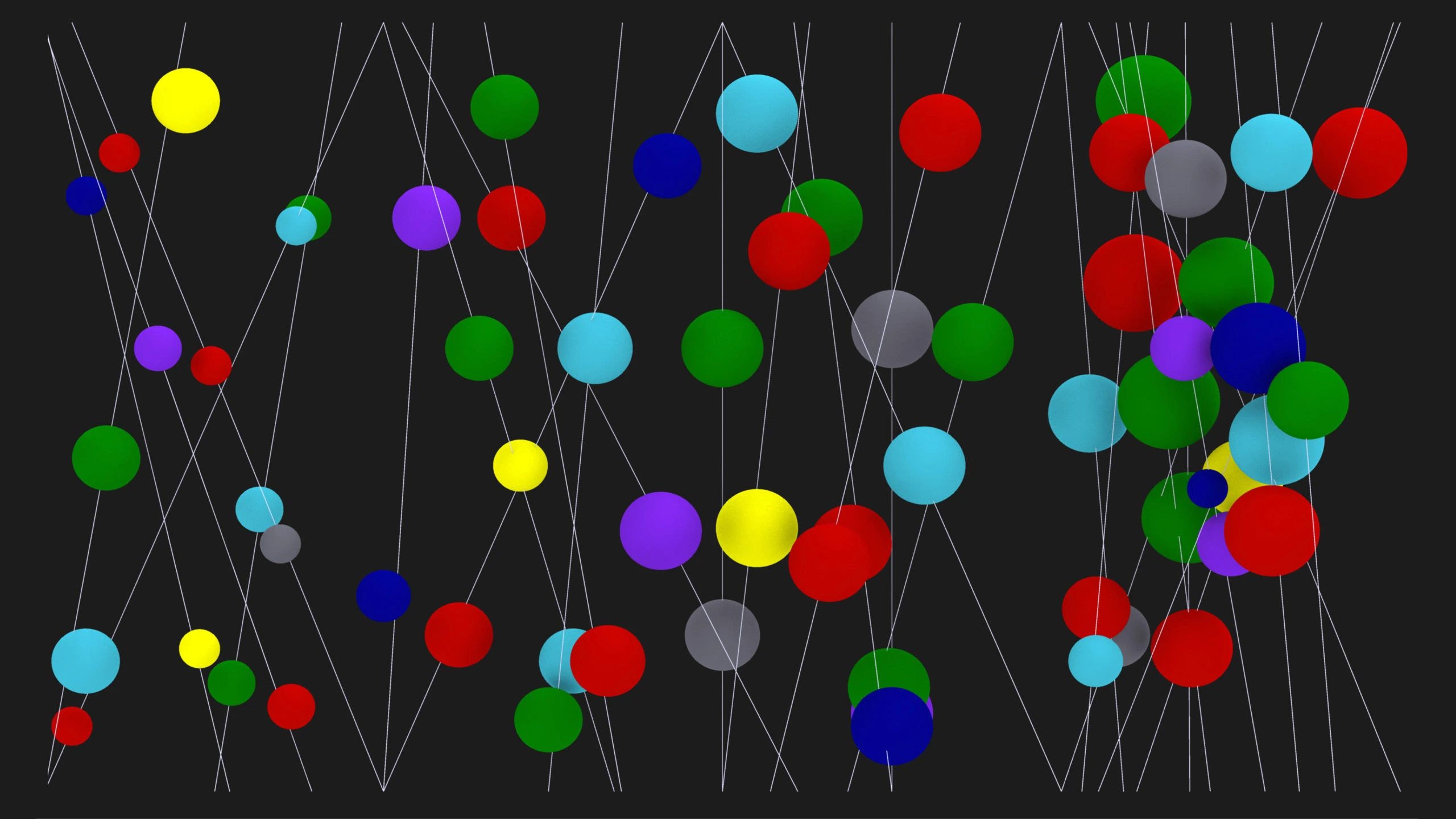
Inspired by World Resources Institute: Climate Analysis Indicators Tool 1990–2010
Retreat of the Gangotri Glacier
Glaciers serve as a crucial freshwater resource, and this illustration portrays the concerning retreat of the Gangotri Glacier. As the largest glacier in the Himalayan ranges, it holds immense significance as a vital source of the Ganges River, which provides water and electricity to India and Bangladesh. The potential disappearance of this glacier carries severe consequences; including the risk of conflicts, mass migration, famine, ecosystem collapse, and altered weather patterns.
The illustration represents the mass of the glaciers, with varying shades of black indicating the volume that has already vanished, emphasizing the alarming trend of glacier loss.

Inspired by the Working Group on Himalayan Glaciology, International Commission for Snow and Ice: 1999
Deforestation
Forests are integral to sustaining the Earth's ecosystem. They provide habitats for diverse animal species, livelihoods for humans, and crucial benefits such as watershed protection, prevention of soil erosion, and mitigation of climate change. Second only to oceans, forests serve as the planet's largest carbon storehouses.
The illustration depicts the alarming global forest loss between 2000 and 2016, highlighting a nearly three-fold increase in deforestation within a span of 16 years. This loss of forests leads to habitat destruction and changes in land use, posing detrimental impacts on the planet's ecosystem.
Inspired by Forest Area (% of land area) data provided by The World Bank
Coral Reef Collapse
Coral reefs are incredibly diverse ecosystems, often referred to as the "Rainforests of the Sea." According to NOAA, approximately 25% of the ocean's fish rely on healthy coral reefs for their survival. However, anthropogenic activities have placed significant stress on these ecosystems. Changes in light, nutrients, and temperature cause corals to expel their symbiotic algae, resulting in bleaching, turning reefs completely white.
The colorful illustration represents the intricate, interlinked nature of a healthy ocean ecosystem. The monochrome illustration depicts the aftermath: the devastating impact of coral bleaching that disrupts the delicate balance of the ocean's ecosystem.

Story of Dying Lakes
Lakes across the globe are facing rapid vulnerability as a result of urbanization, population growth, river diversion, groundwater exploitation, climate change, and anthropogenic pollutants. These forces gradually degrade the interconnected systems of lakes that have thrived for centuries.
The illustration depicts the story of Makarba Lake, one of the largest lakes in Ahmedabad; a small-scale example featuring three interconnected lakes. In the past, when one lake overflowed, its water naturally flowed into the others. Today, the construction of highways, illegal sand mining, changes in land use, and excessive groundwater extraction have degraded the system entirely. The illustration conveys this narrative through varying shades of blue, symbolizing the alarming decrease in water levels.

Inspired by the story of Puttenahalli Neighborhood Lake Improvement Trust
The Path We Have Taken
As humans, our intervention in the Earth's existing ecosystem has led to its degradation in order to fuel our modern lifestyles. These intrusions are resulting in unforeseen and undesirable changes worldwide, costing the lives of millions. Data and statistics from various institutions indicate that we are heading toward disastrous consequences that will impact future generations.
The illustration abstracts the path we have taken; one that ultimately leads to a dead end marked by destruction, death, and darkness. It serves as a symbolic representation of the detrimental consequences of our current trajectory, and emphasizes the urgent need for change.

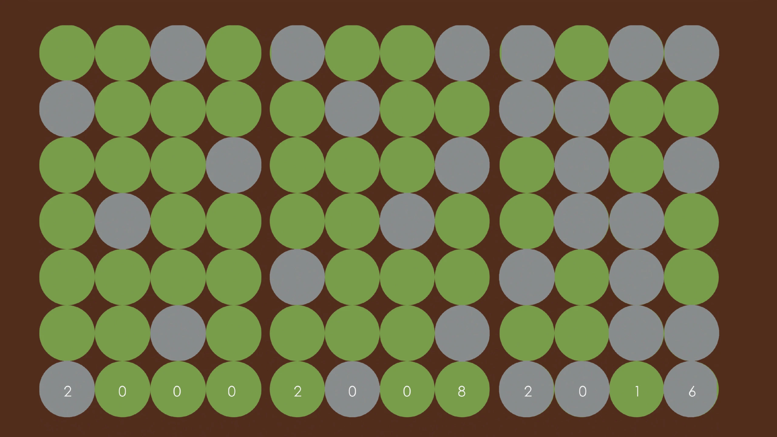
Lost in a Labyrinth of Choices
Every day, individuals make numerous choices that impact the environment; from the food they consume to the mode of transportation they use and the products they purchase. Often, the choices that are cheaper and more convenient have severe consequences for the planet, while less damaging alternatives require more effort and consideration.
The maze in the illustration represents these choices. The grey areas symbolize the easiest options with the most devastating effects. The shadowed path signifies alternative choices that serve as a step towards mitigating damage. The transition of green throughout the maze represents the most crucial and challenging path; the growing awareness among individuals to make conscious decisions, and the progress that comes from acknowledging the climate crisis.
