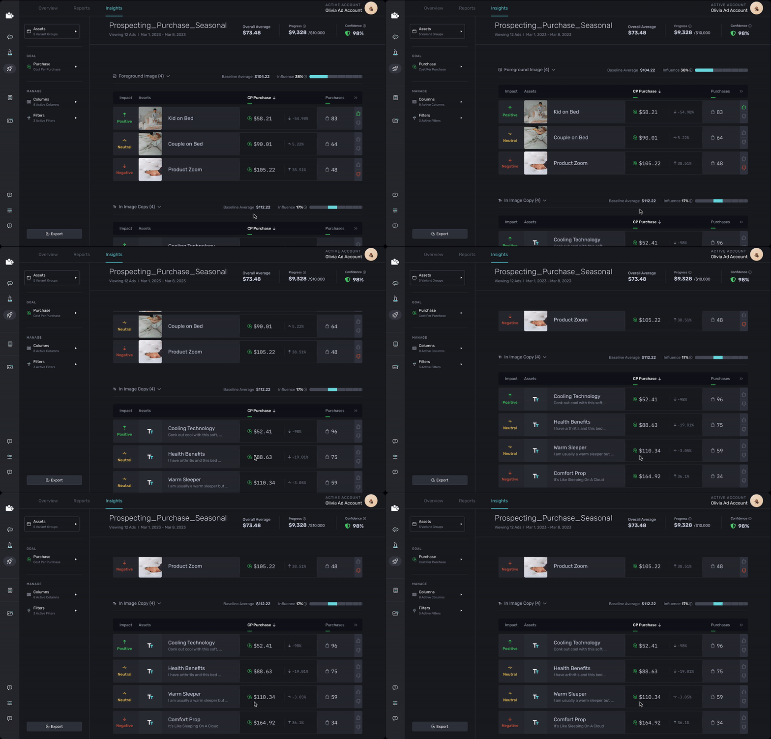


Enabling users to analyze their advertising data with confidence

Role
Product Designer, Data Visualization Methods
Timeframe
2 Years
My Responsibility
User Research
Information Architecture Design
UI/UX Design
Visual Design & Design Systems
Prototyping & Iteration
User Testing & Feedback Incorporation
Design Handoff & Documentation
Design Quality Assurance
Collaborated with
Head of Product
Product Designers
Development Team
QA Team
Data Science Team
Marketing Specialists
Customer Success
Marpipe utilizes multivariate testing to reveal insights into how different creative variables affect ad performance, providing users with a platform to create, test, analyze, and scale more effective ads. Our clientele includes Crocs, Express, Revolve, Kate Spade, DSW, and Brooks.
The platform enables users to upload assets, design ads, launch campaigns, and analyze data collected from various platforms, ultimately providing insights on which elements and ads to scale. I lead the design efforts for the launching and analyzing features, aiming to make insights more intuitive and accessible to all user types. In this case study, I showcase the Agile process I employed to research and design key features, enhancing users' ability to analyze and scale their ads effectively.


Transition the platform from a managed service, where the customer success team provided hands-on support for data interpretation, to a self-serve platform where users are empowered to independently utilize the platform and analyze their data to scale ads with minimal support.
The user interface when I joined the team in September 2021 facilitated the analysis of diverse variables within advertisements, covering both the ad in its entirety and its individual components. Designed primarily for our internal team, the platform demanded extensive onboarding time and technical expertise to extract insights from the data. Its complexity and the overwhelming volume of data frequently discouraged users from engaging with it.
In the initial stages, we delved deep into the data provided by Mixpanel and Datadog, meticulously analyzing platform usage patterns. Our exploration revealed a diverse user base comprising existing, prospective, and churned users, each offering unique insights into their interactions with the platform.
User Profile Breakdown
User Research Goal
Examples of Interview Questions
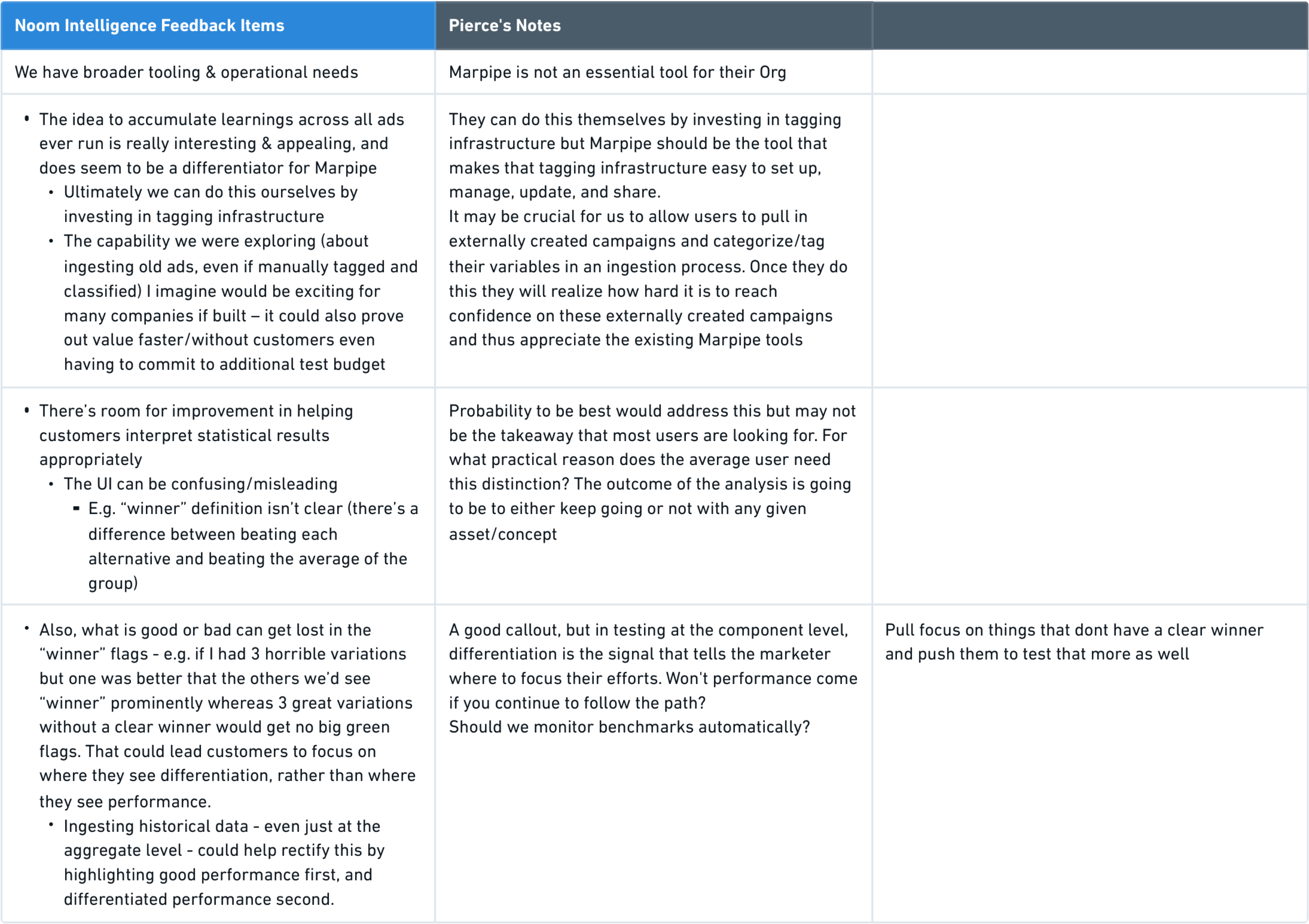
Information Sorting
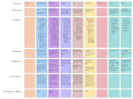
After conducting comprehensive customer interviews, we identified gaps in the product experience. Leveraging the card sorting method, we prioritized the most requested features to include in our product roadmap. We documented customer responses and identified underlying issues contributing to the identified gaps.
Problem Identification
Interviewees expressed a lack of perceived return on investment with Marpipe due to challenges in utilizing and interpreting collected data within their workflow.
Scope of Improvement
To address these challenges, we proposed the following improvements:
As Marpipe transitioned from a managed platform to a self-serve platform, the user base expanded to encompass a wider range of users. In particular, the platform began targeting small and medium-sized agencies in addition to unicorn companies.
This shift in focus necessitated a deep understanding of the diverse range of target users, their specific needs, and their varying levels of familiarity with data interpretation. We undertook the task of restructuring and modifying the information architecture to accommodate all user types and teams, ensuring a seamless experience that empowered even those less familiar with data interpretation to navigate the platform and leverage its features effectively.
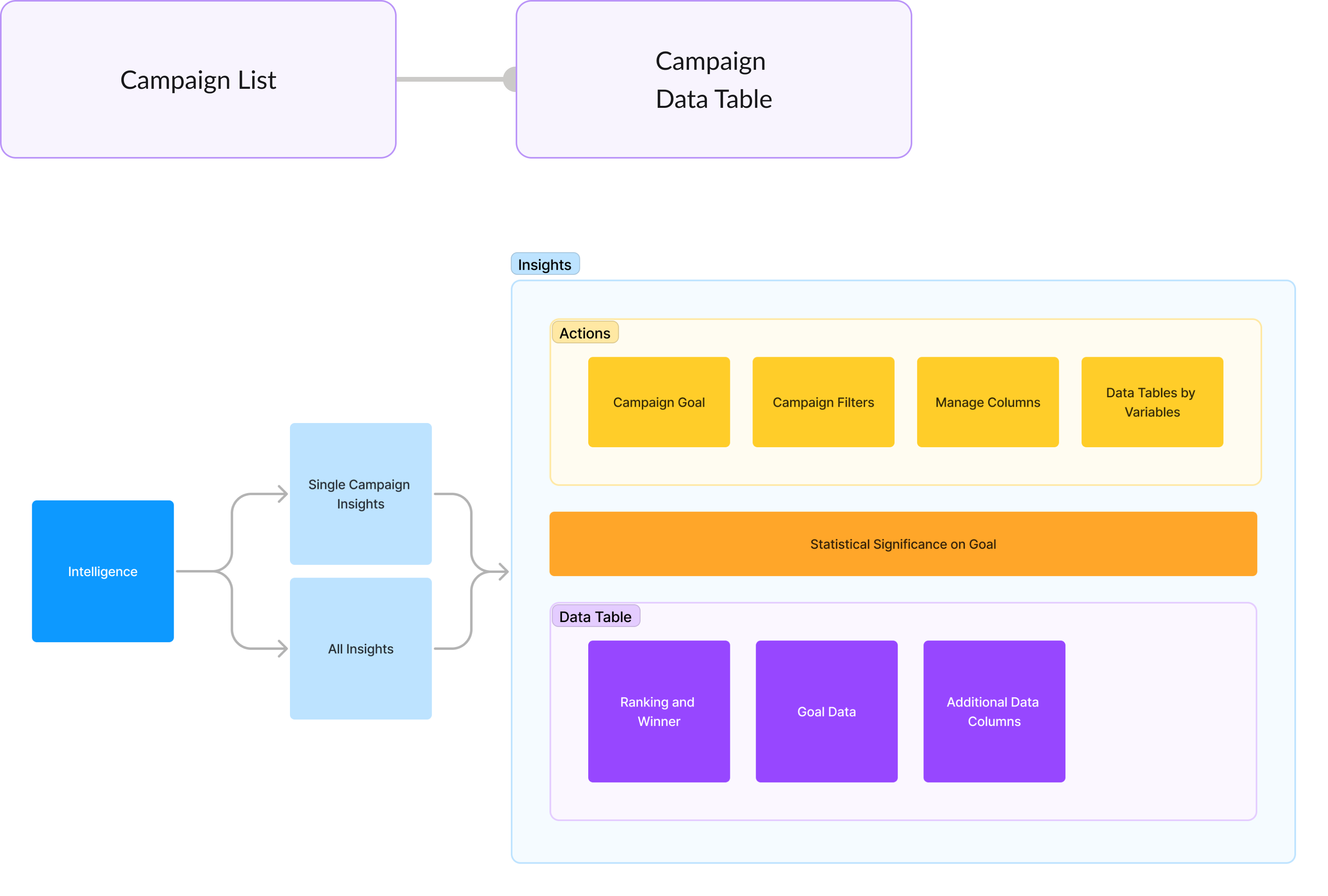
To optimize the user experience, it is crucial to consider the user's mental model. By understanding the needs of advanced and average users, I designed an interface that caters to the unique requirements of each group.
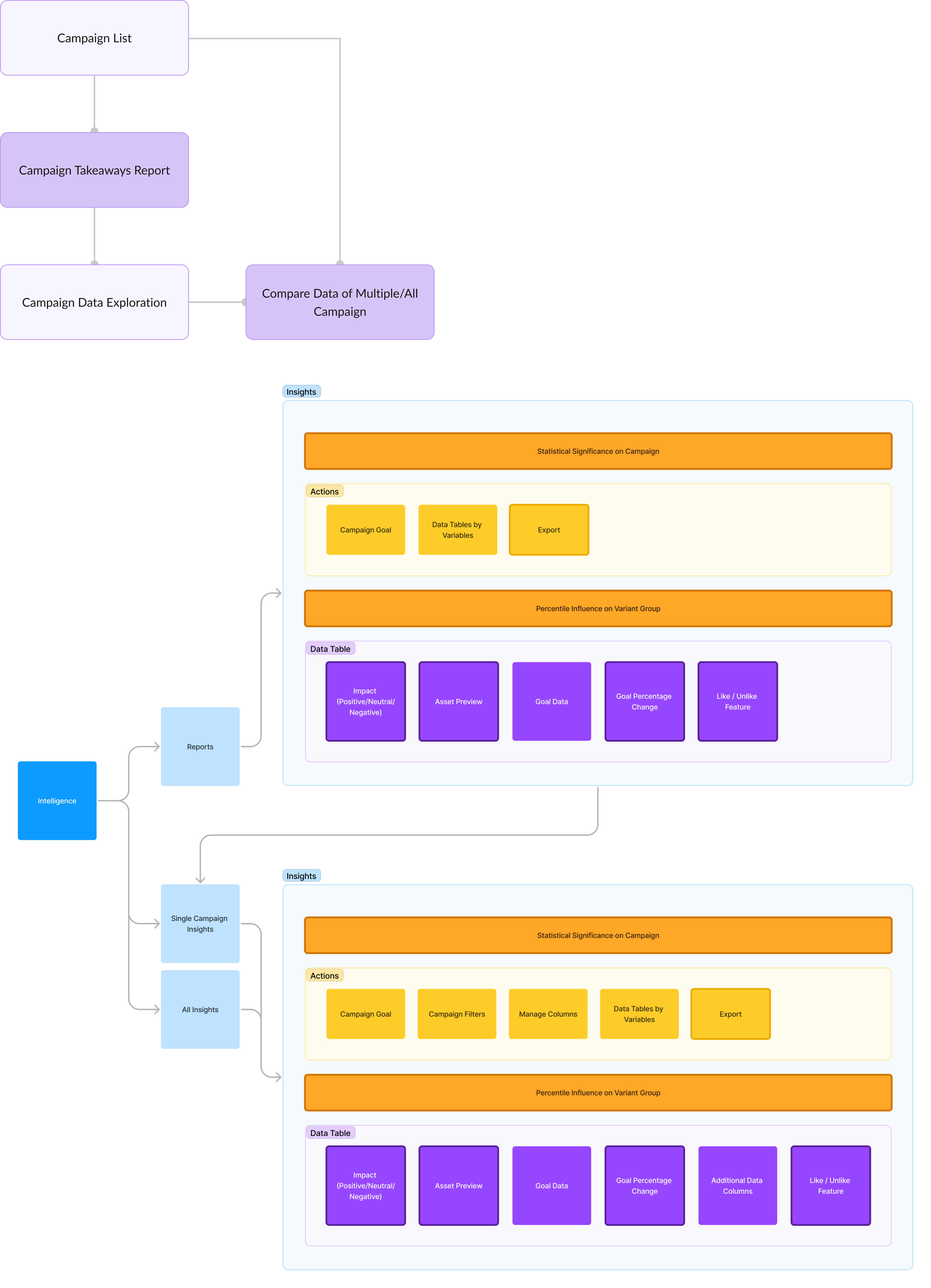
To achieve this, I created two distinct views for data exploration within Marpipe. The first view focused on analyzing individual ad campaigns, while the second allowed users to compare multiple or all ad campaigns. However, we acknowledged that both of these views could overwhelm some users, particularly those with less experience in data interpretation.
To address this, I iteratively designed and implemented a report view. This simplified view presents users with a concise overview of key data, statistical analysis, and interpretation. It offers an option for users to delve deeper using advanced data filtering, accommodating both advanced and average users. This structured approach also enabled us to identify the necessary features for creating an intuitive experience.
Proposed and Now Implemented User Journey
Feature Research
To ensure the successful development of the proposed user flow and its associated features, we initiated in-depth research on best practices for each feature. Our goal was to define clear technical requirements and assess the feasibility of implementation in collaboration with the development team.
This research phase involved studying industry-leading practices related to the identified features. We delved into existing solutions provided by other platforms to gather insights into successful implementations and potential pitfalls. By benchmarking against established practices, we aimed to create a foundation for robust and effective feature development.
Active collaboration with the development team was a key component of this research effort. Engaging in open communication allowed us to align on technical considerations, evaluate potential challenges, and ensure that the proposed features could be seamlessly integrated into Marpipe's existing infrastructure.
This proactive approach to feature research laid the groundwork for informed decision-making throughout the development process, ensuring that our envisioned features not only met user needs but also adhered to best practices and technical feasibility.
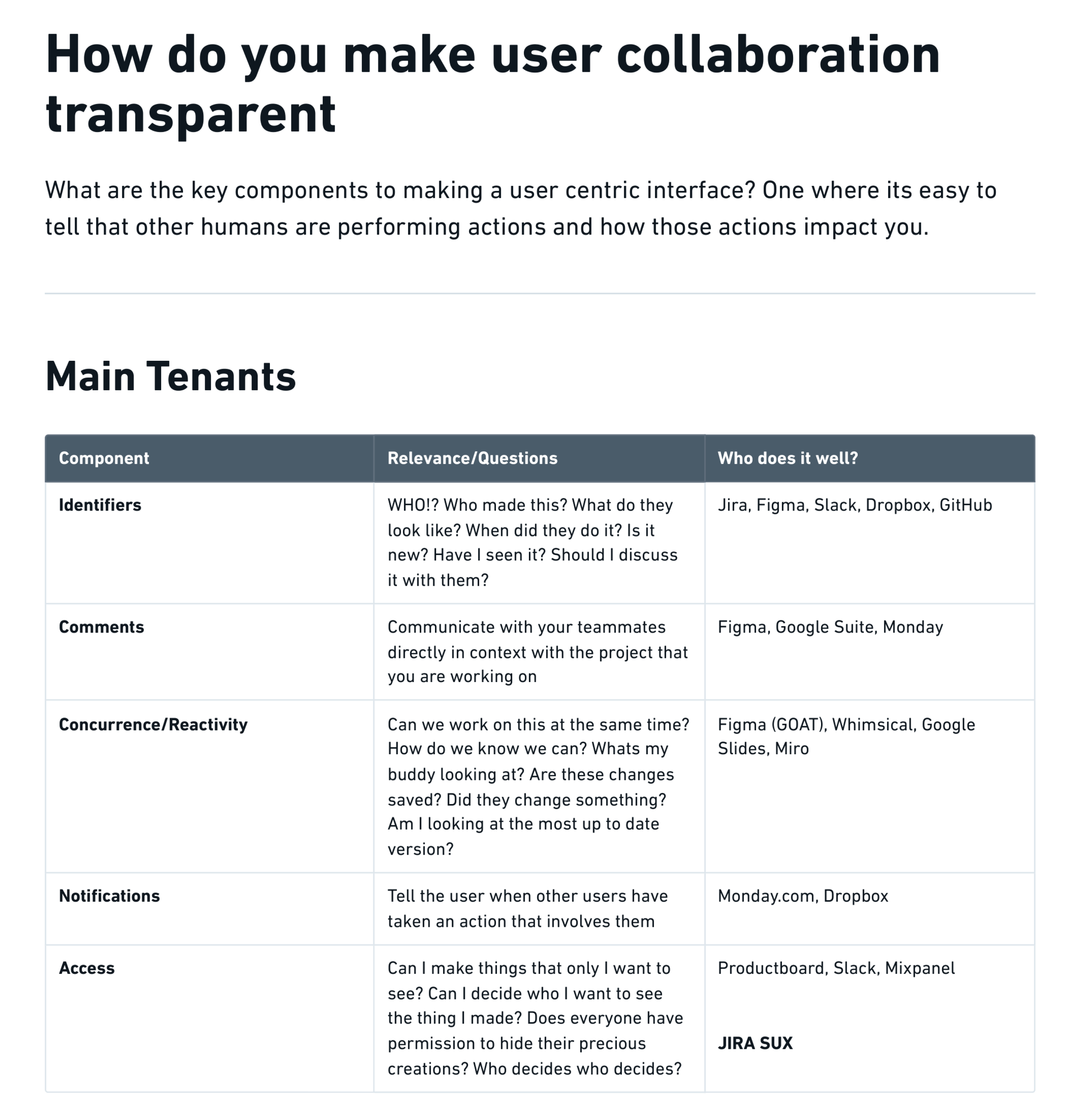
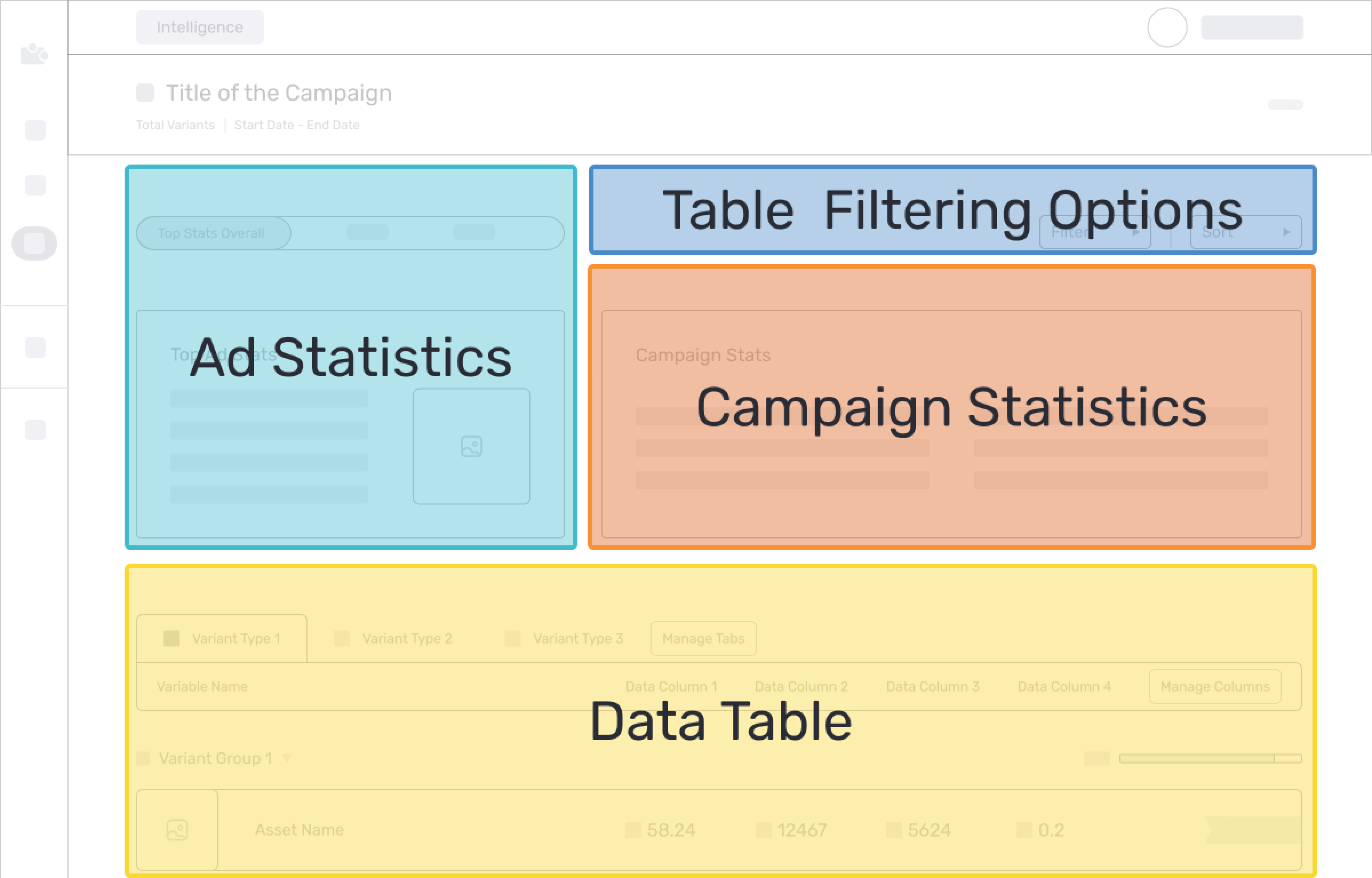
During user interviews, we discovered that the current visual design and structure of the intelligence views were causing users to overlook crucial actions and information. This resulted in difficulties focusing on the most relevant metrics and navigating the table efficiently. To address this challenge, I redesigned the information sections, introduced a restructured layout and designing consistent components to enhance the visual hierarchy.
I developed an interface that mirrored the mental model of our users and utilized distinct sections for different insights, simplifying the data browsing experience. Moreover, this interface prioritizes compatibility with screen reading software, enhancing design accessibility.
Old Information Flow
Ideal Information Hierarchy
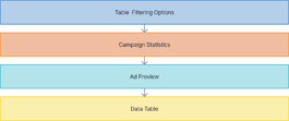
Proposed Information Flow
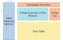
Proposed and Now Implemented Wireframe
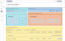
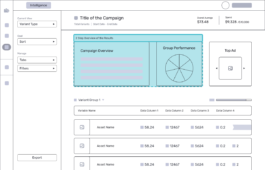
Two-Step Overview
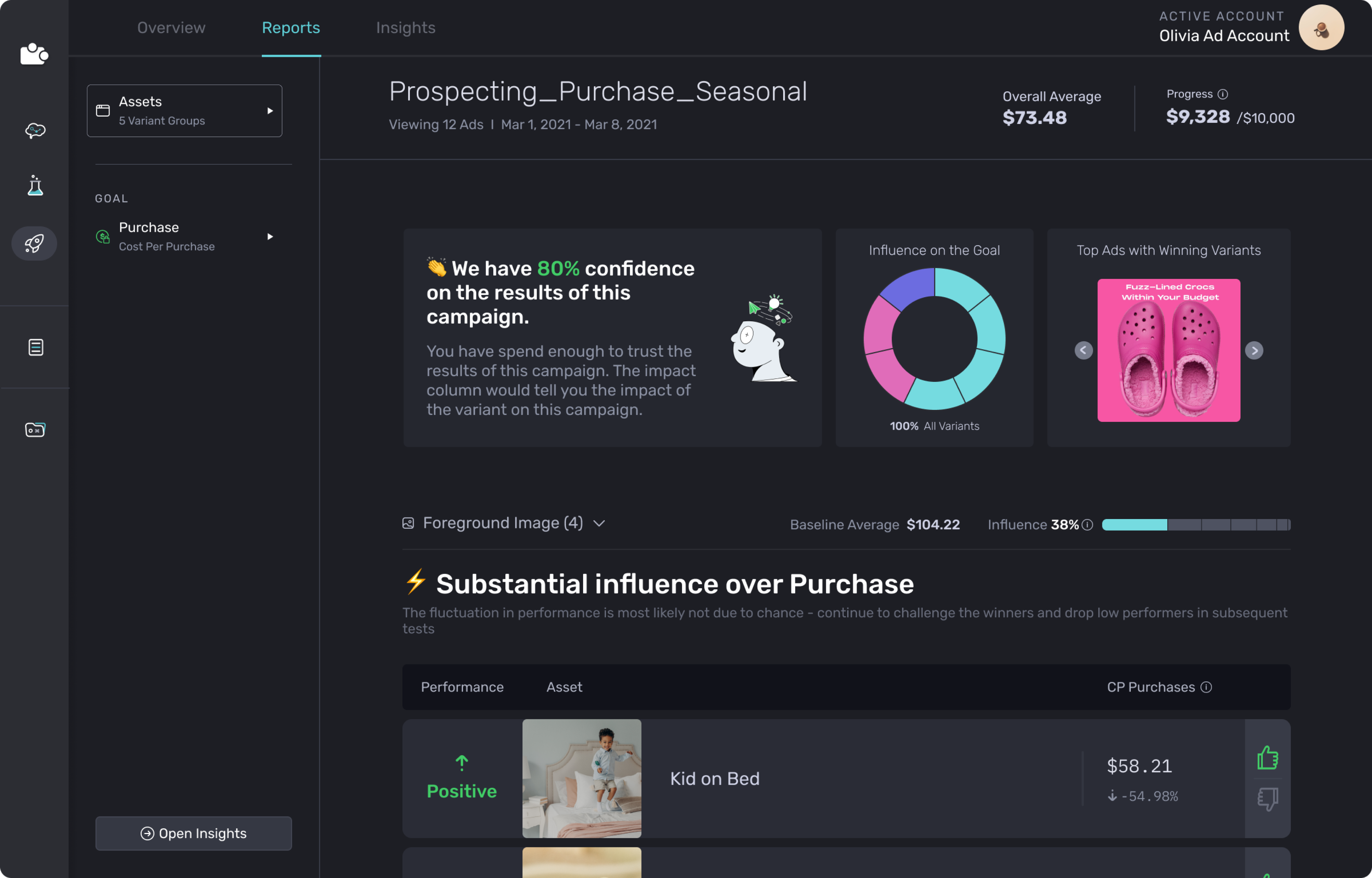
I proposed a two-step overview of the collected data. The first step provided a mad-lib description of the campaign's performance, while the second step visualized the impact of each group in achieving that performance. This approach established an expectation for the data tables without delving extensively into each group.
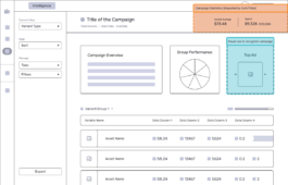
Top Ads Preview
To address the complexity and lack of relevance in campaign names, I introduced a Top Ads Preview section to serve as a reminder for users about the elements tested in the campaign. Additionally, I included overall campaign statistics at the top, enabling users to conveniently access averages and expenditure information while scrolling through the table.
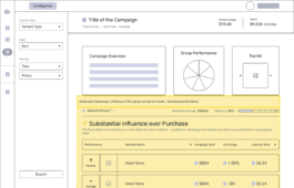
Overall Group Takeaways
I included overall group takeaways within the header and implemented a collapsed view of the groups, offering users a preview of the items within each group.
Visual Distinction
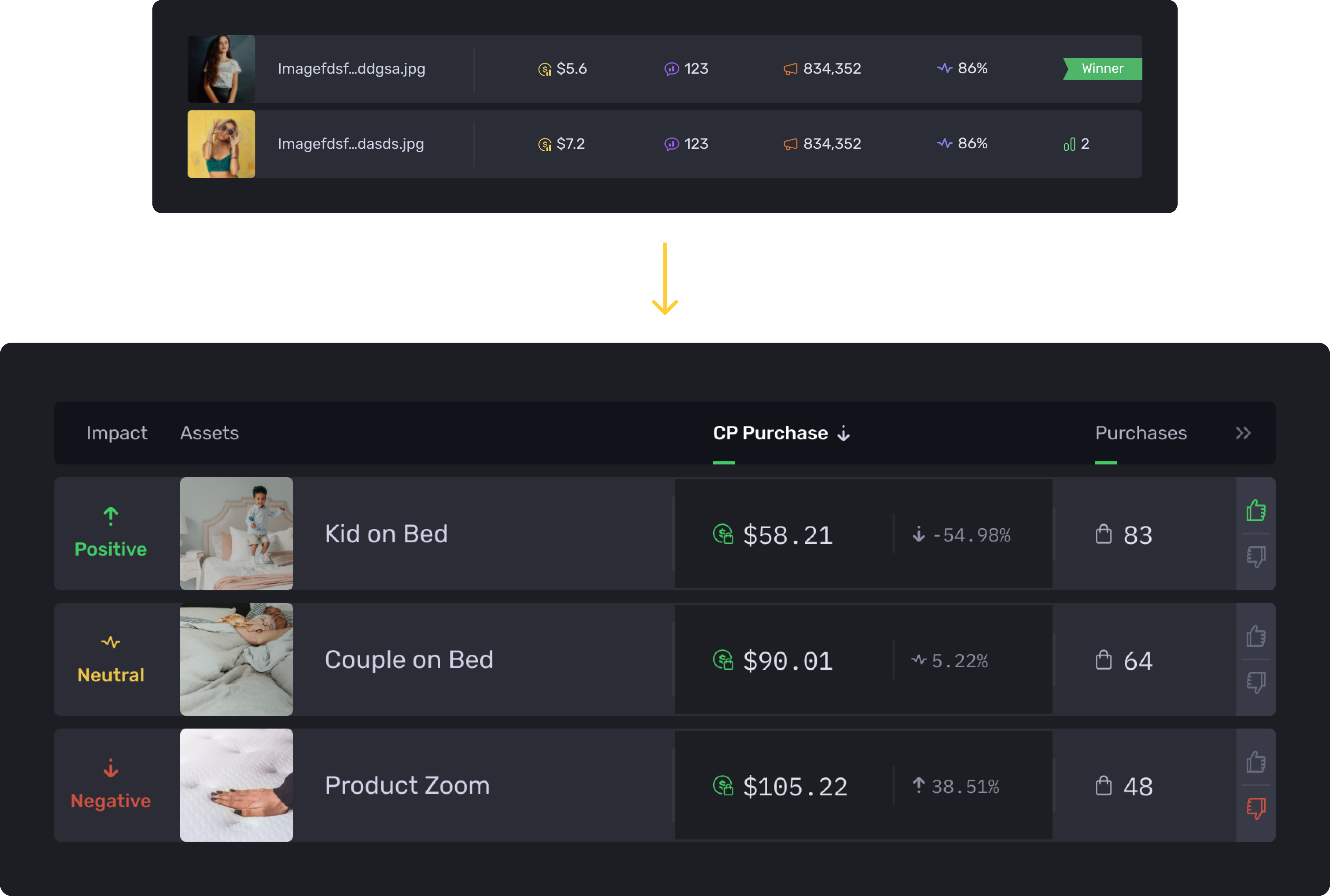
In the data table, I removed colors from all icons except for the goal column, which was highlighted with a distinct background color. This visual distinction effectively guided users to focus on the most significant metrics within the table.
Additional Context
To provide users with additional context regarding their campaign goals, I introduced other relevant data columns, such as % change and return on ad spend.
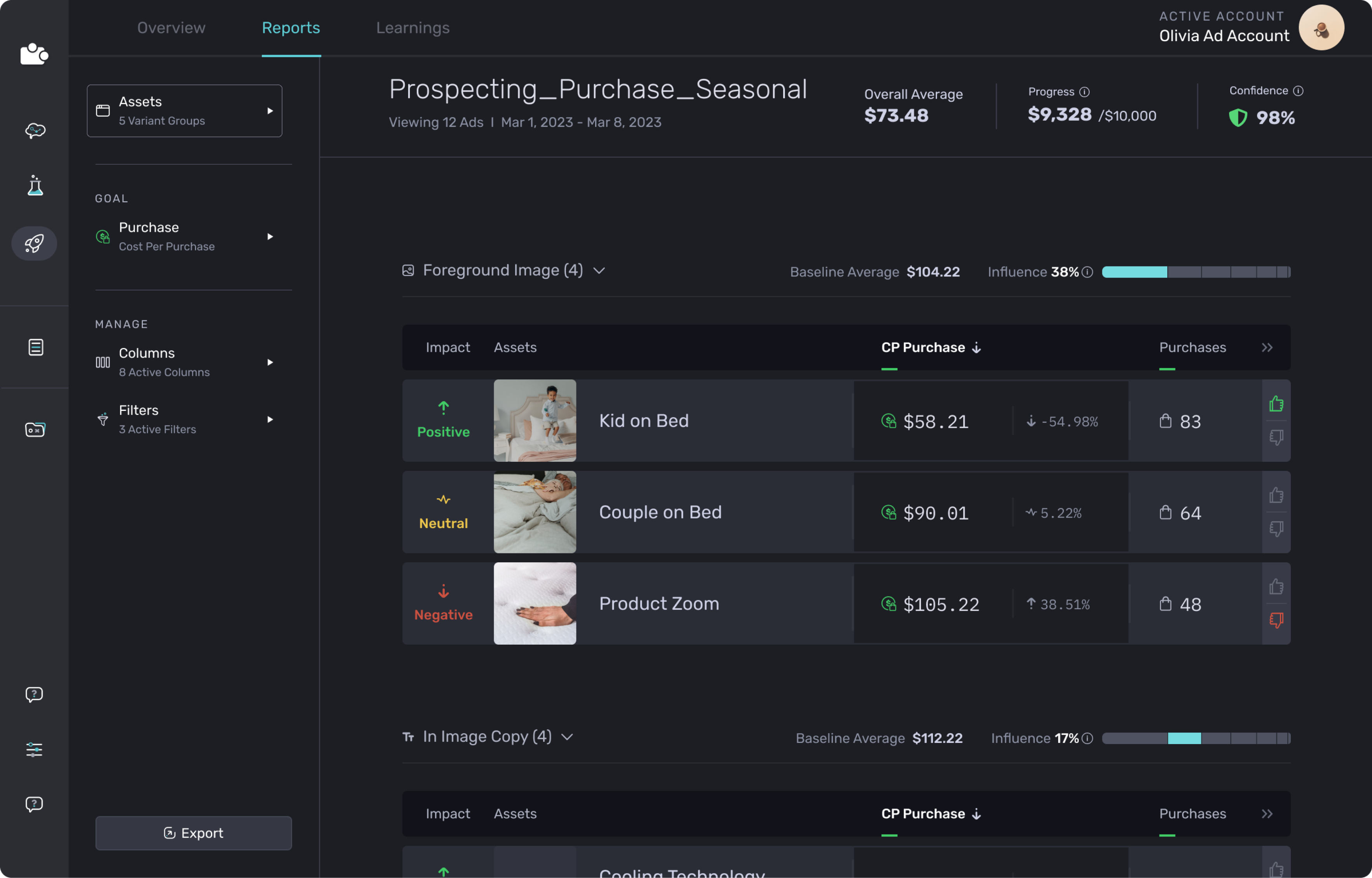
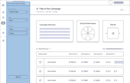
Consolidated Actions
All the actions that a user could take on the data table were consolidated into a side navigation, which freed up vertical screen space for the table itself. This consolidation made it easier for users to locate the actions they needed and understand the purpose of each section.

Design Improvements
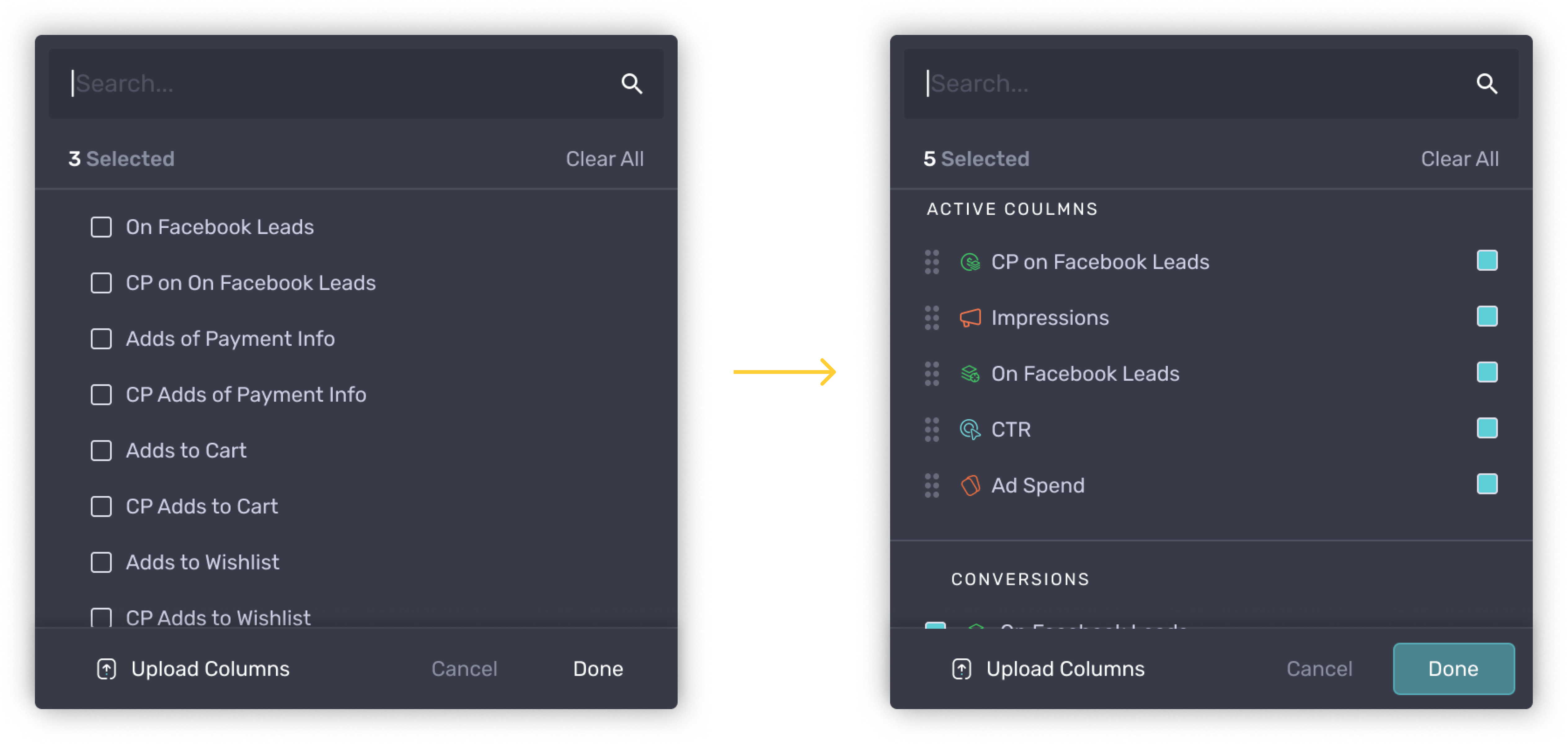
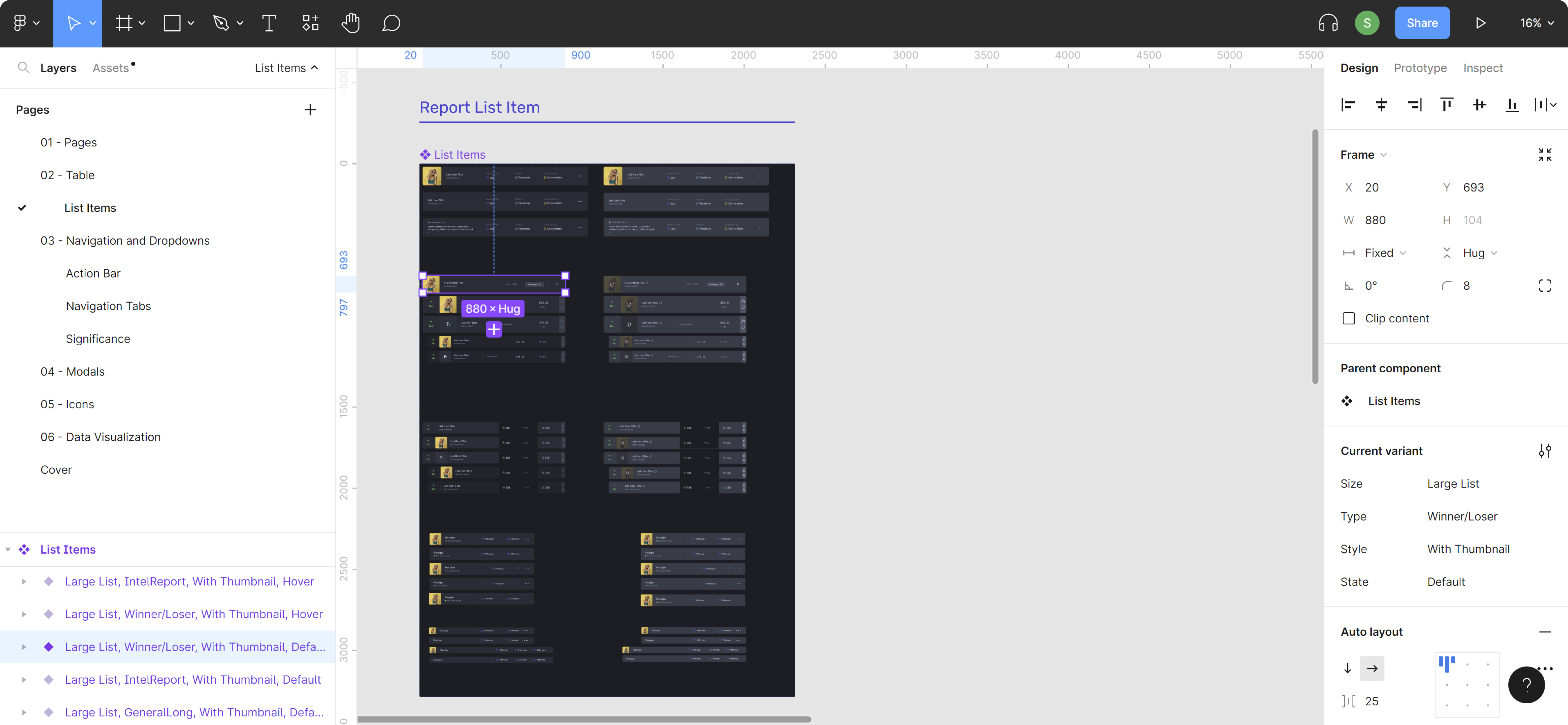
Below are examples of modifications and enhancements I made to the design system components to enhance the user interface, experience, and accessibility.
Responsive Design Guidelines
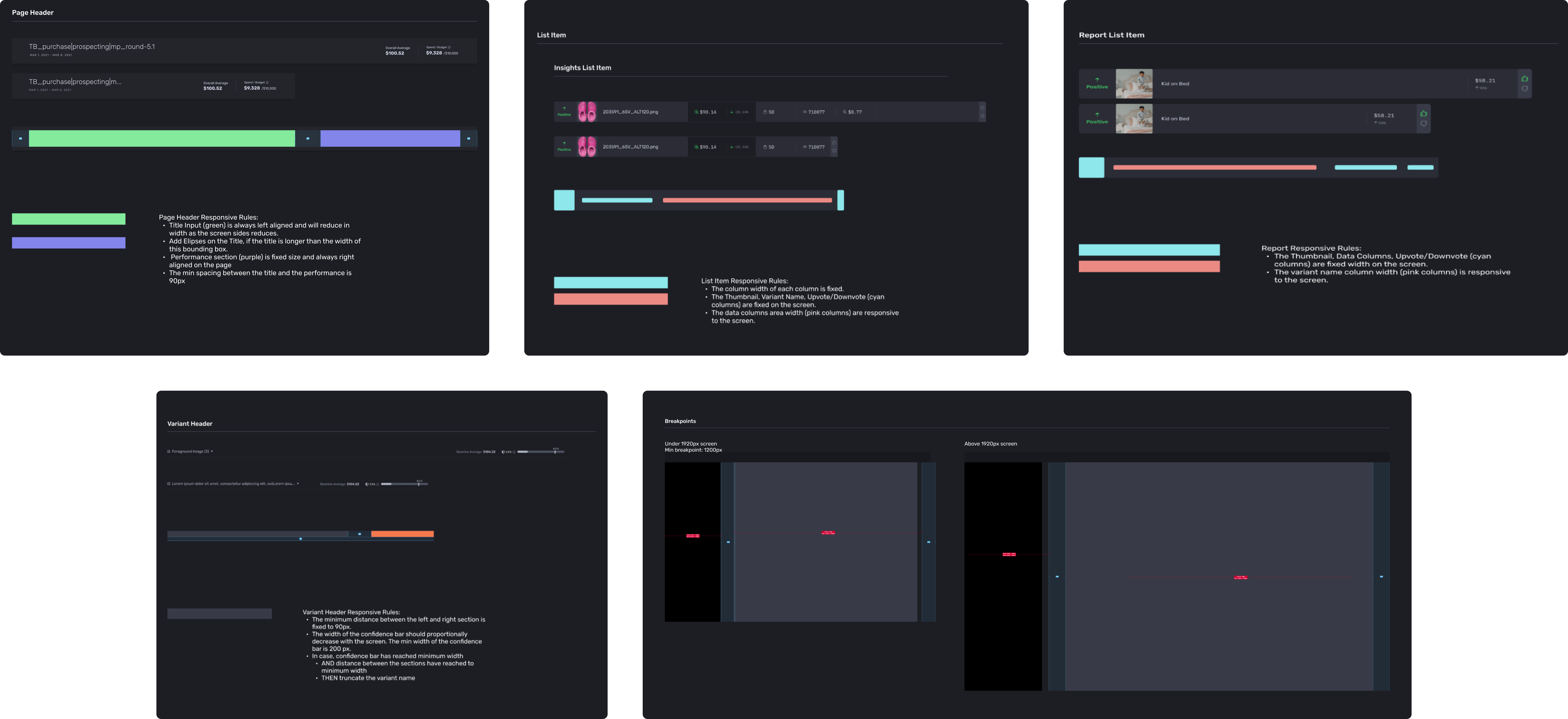
We placed a high priority on ensuring that our interface remains accessible to users across a wide range of devices and screen sizes. To achieve this goal, I established responsive design guidelines for our UI components. These guidelines allow our interface elements to adapt and adjust fluidly to different viewport sizes, ensuring a consistent and optimized user experience across all devices.
To streamline the user experience in data interpretation, I closely examined users' interactions throughout a campaign. This in-depth analysis allowed me to introduce automated takeaways, prompts, and implement necessary design refinements.
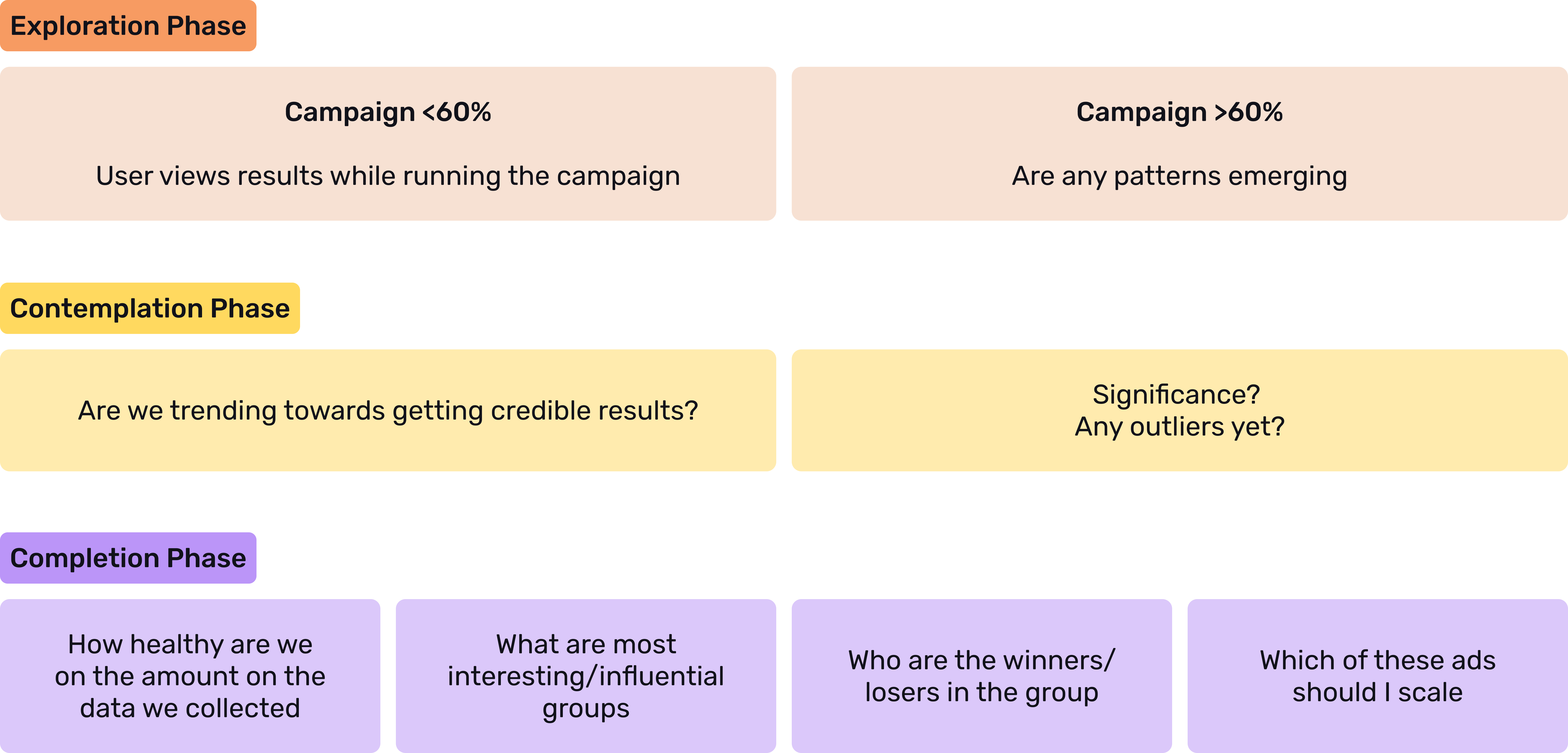
Data Analysis
In a collaborative effort with the data science team, I conducted extensive research on diverse analyses, calculations, and data models. The goal was to determine the most accurate takeaways for campaigns, considering factors such as statistical significance, the influence on variant groups, and the impact on individual variants. Once we developed an efficient model, I worked closely with the team to understand the backend calculations and incorporated this knowledge, along with insights from users' journeys, to inform the design process for the new, simplified intelligence.
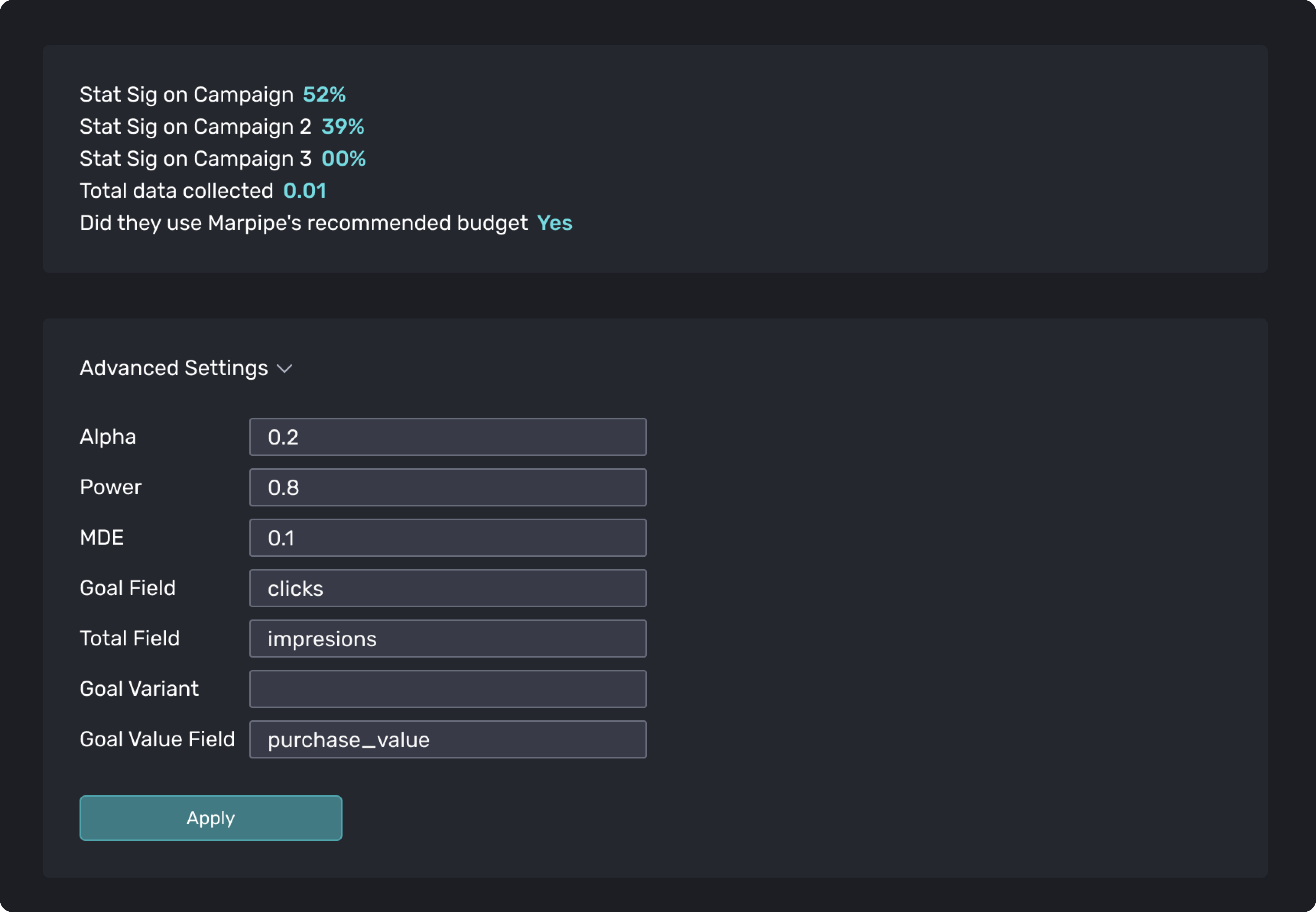
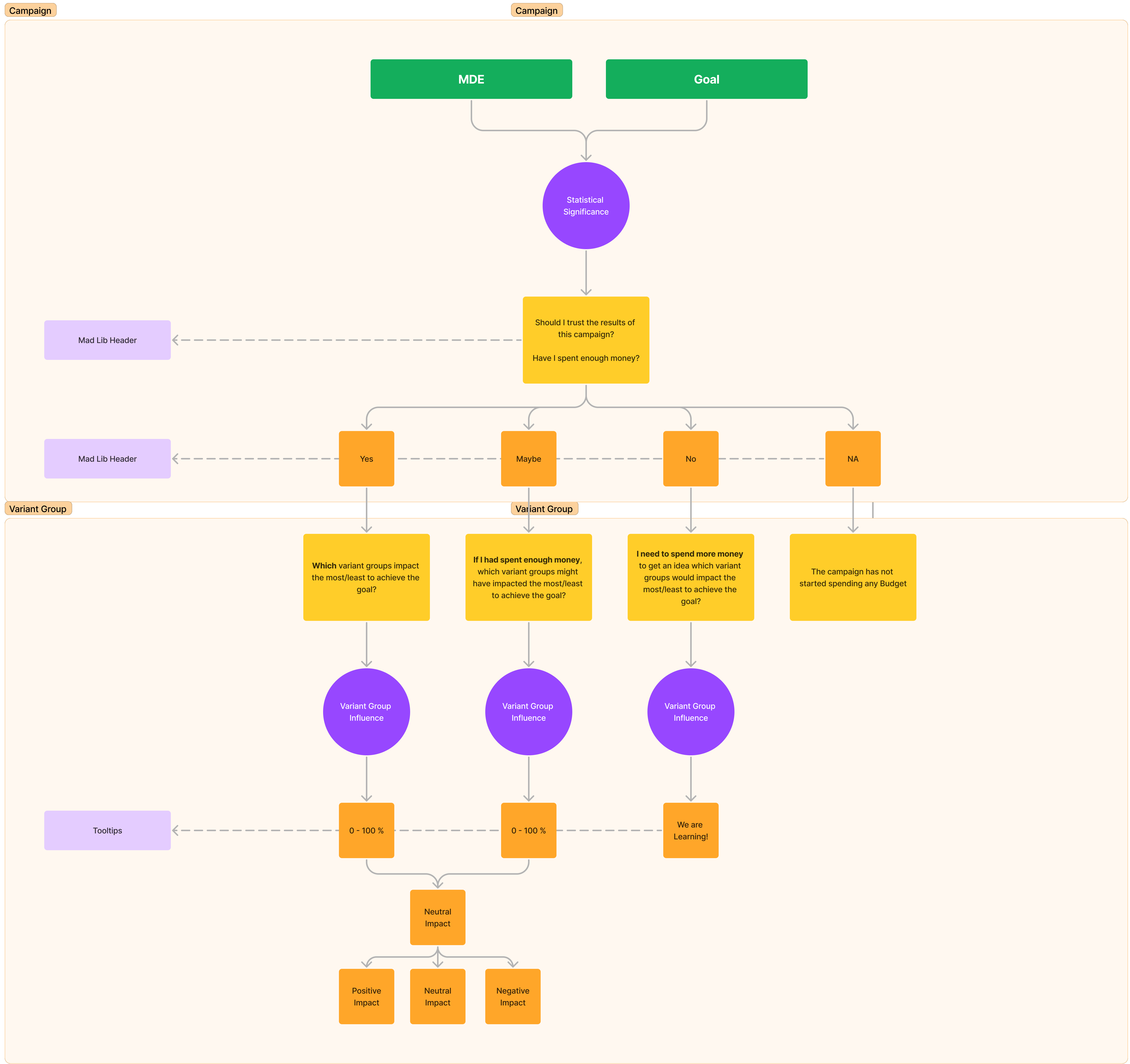
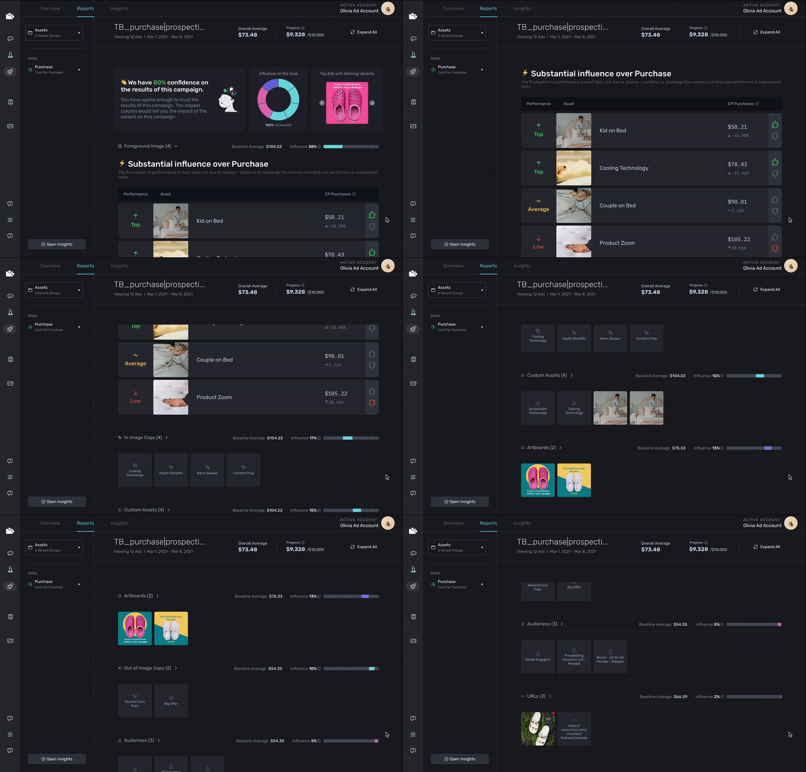
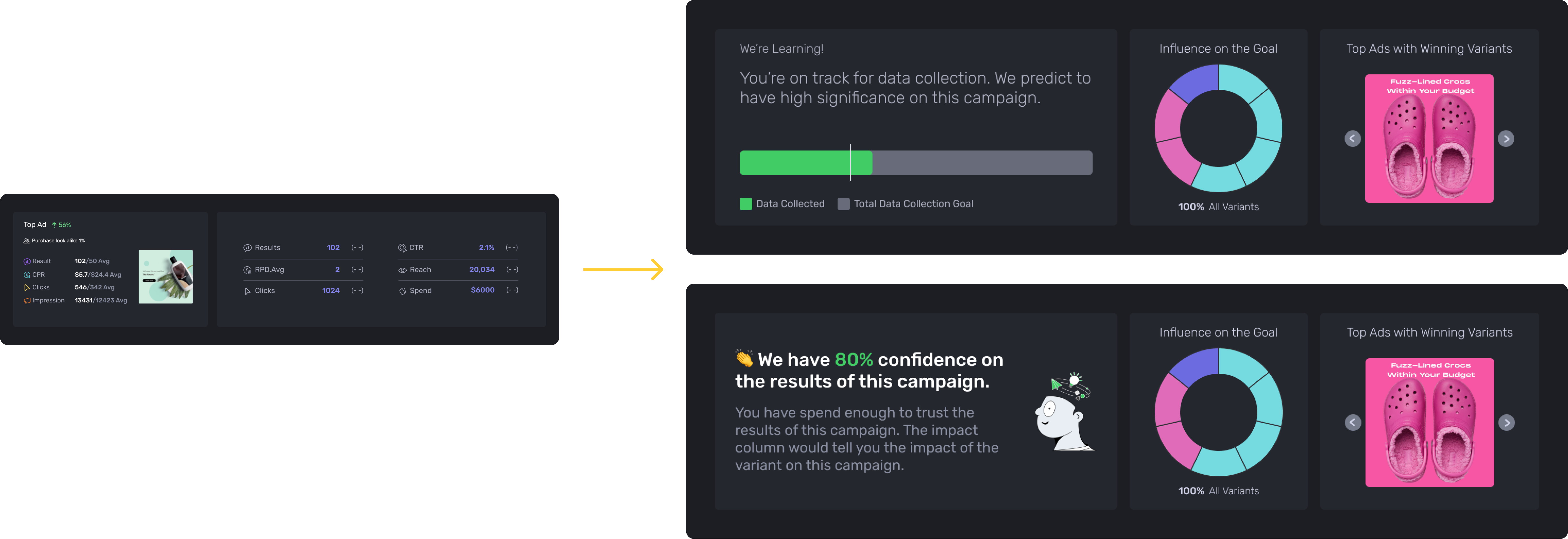
Campaign Overview
The overview is structured into three key sections:
Campaign Result Overview (Parent): This section provides a comprehensive summary of the campaign's performance, offering a high-level understanding of its success metrics.
Individual Group Influence (Child): Delving deeper, this section explores the impact of each individual group on the overall campaign results, allowing users to analyze the performance of specific elements.
Visual Cue Reminder: To aid user recollection, a visual cue is incorporated, reminding users of the specific elements tested within the campaign. This reinforces the key aspects under consideration.
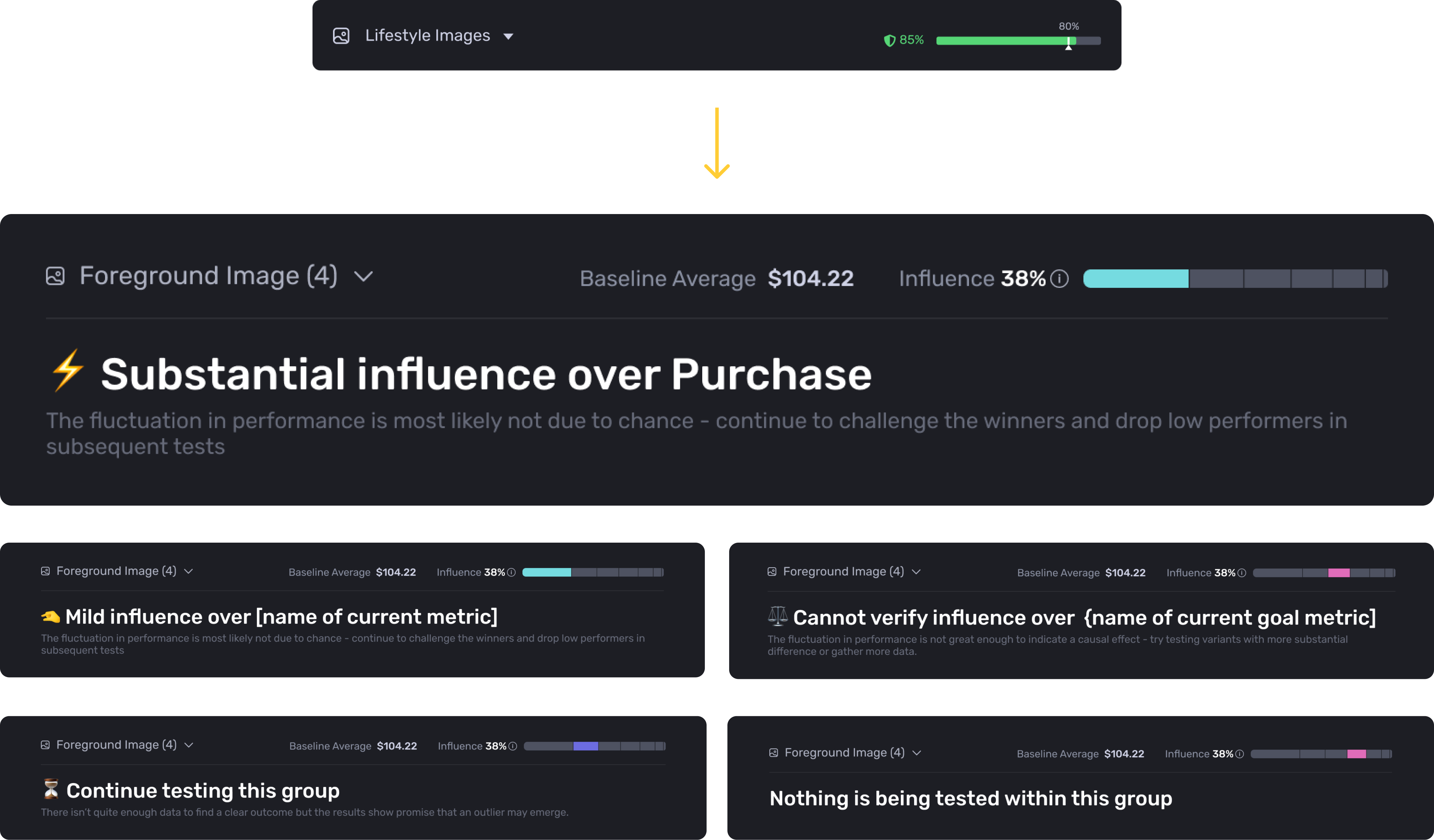
Group Header Design
The header madlib succinctly encapsulates the primary takeaway from the data, offering users a quick insight into the overarching message. Meanwhile, the sub-header serves as a navigational guide, directing users towards the optimal actions they should consider for each individual variable within the groups. This dual-layered approach ensures clarity in both the overarching narrative and the specific steps users can undertake for detailed analysis.
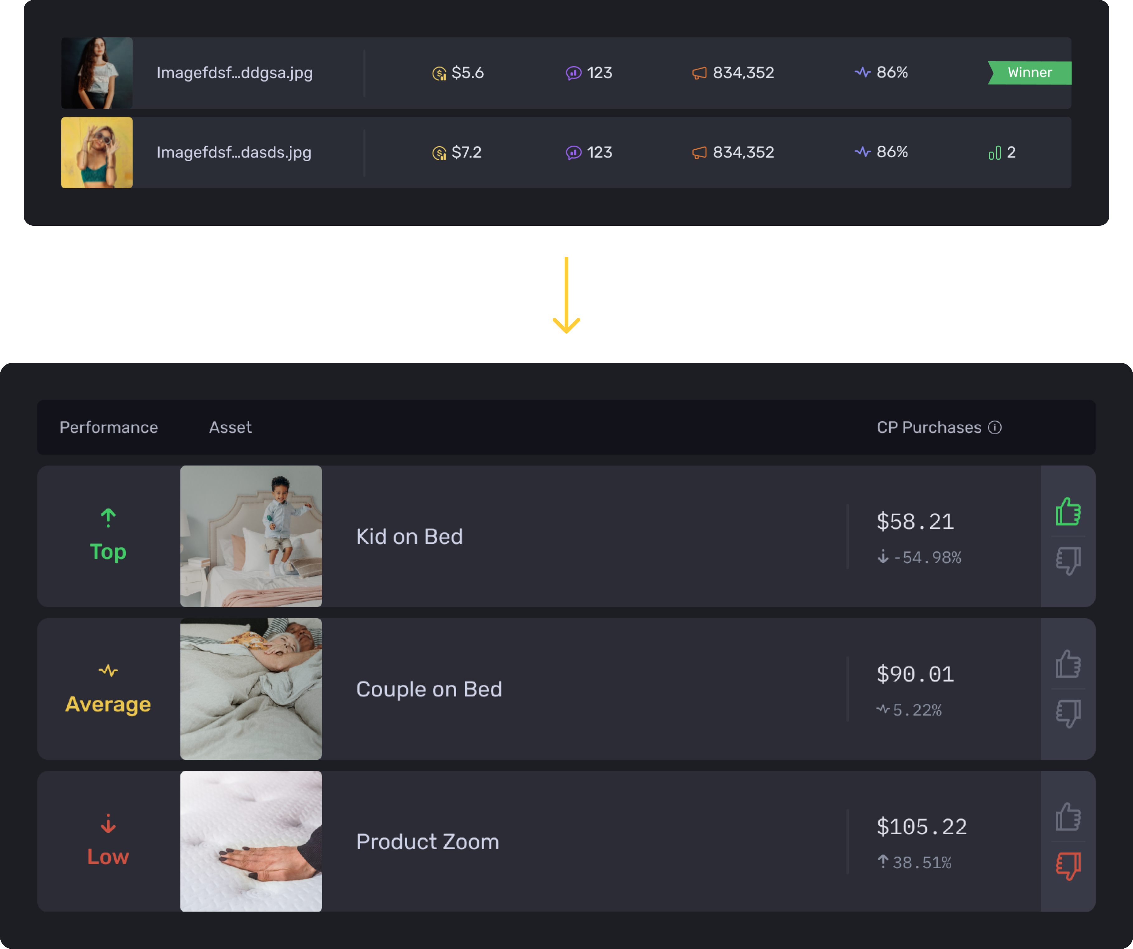
Report Table Design
In the report view, emphasis is placed on presenting users with a concise overview featuring only the most critical metric. This streamlined approach ensures that users can quickly grasp the essential insights without being overwhelmed by unnecessary details.
Advanced Data Exploration
This view empowers users to delve deeper into their data, allowing them to compare and analyze various data points comprehensively.
